This post may contain affiliate links. When you purchase through links on our site, we may earn an affiliate commission.
There’s something magical about blending seaside charm with seasonal freshness. As someone who’s spent years perfecting breezy, nature-inspired interiors, I’m thrilled to show you how thoughtful design choices can turn any room into a tranquil retreat. Let’s explore how to capture that effortless balance between relaxed coastal vibes and spring’s renewal.
Timing matters when refreshing your space. Warmer days and longer sunlight create the ideal backdrop for light, airy tones that mirror ocean waves and sandy shores. Through trial and error, I’ve discovered five distinct combinations that evoke seaside serenity while feeling energizing—perfect for this time of year.
What makes these schemes special? They’re not just pretty shades—they’re tools to connect your home to nature’s rhythm. Whether you’re updating a living room or reimagining a bedroom, I’ll share practical ways to layer textures and balance tones. You’ll learn how to create spaces that feel both uplifting and grounded, season after season.
Key Takeaways
- Seasonal updates bring new energy to coastal-inspired spaces
- Natural elements guide palette selection for authentic seaside charm
- Five curated combinations offer versatility for different rooms
- Practical design strategies ensure cohesive, lasting results
- Light-reflective hues enhance brightness and connection to outdoors
Introduction to Coastal Spring Color Palettes
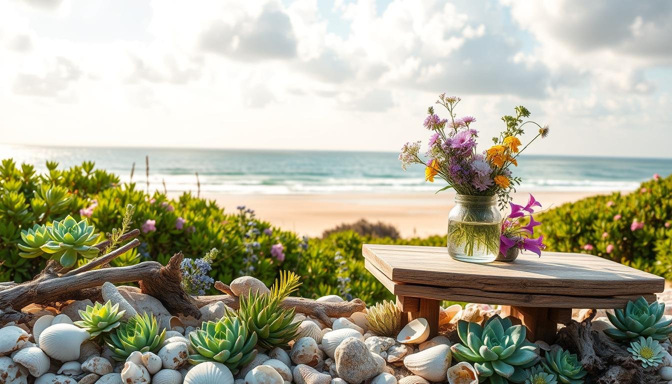
The ocean’s ever-changing beauty offers endless ideas for home decor. For years, I’ve studied how natural landscapes influence interior design, especially through hues that mirror shorelines and sunlit waters. These combinations create spaces that feel alive yet peaceful—perfect for welcoming warmer months.
https://www.youtube.com/watch?v=LQ1IKcUv1x0
Why I Love Coastal Inspirations
What draws me to these schemes? They balance energy and calm like crashing waves meeting soft sand. I’ve seen clients relive beach vacations simply by adding seaglass greens to their walls. Unlike trends that fade, these tones adapt to modern farmhouses or minimalist lofts while keeping their relaxed essence.
What to Expect from This Guide
We’ll explore five unique combinations tested in real homes. You’ll discover how light affects your choices and ways to blend textures for depth. I’ll share why certain blues lower stress levels and how beiges can make rooms feel sunnier. By the end, you’ll have tools to create spaces that breathe with seasonal renewal.
Ready to transform your home? Let’s start with the psychology behind these hues and how they interact with your existing decor.
Understanding Coastal Color Inspiration
Living near the shore taught me how nature’s rhythm shapes great design. When creating spaces that breathe with seaside energy, I always return to three core elements: shifting tides, weathered textures, and sunlight’s dance on water. These patterns reveal why certain combinations feel timeless while others clash.

Nature’s Influence on Coastal Hues
Early mornings at the beach showed me how light transforms the sea’s appearance. That deep midnight blue? It’s actually layered tones shifting with the sun’s position. I apply this lesson by using variable finishes – matte walls might echo calm waters, while glossy accents mimic midday sparkle.
Sand isn’t just beige. Under magnification, it reveals pink shells, gray pebbles, and golden flecks. My favorite neutrals mix warm and cool undertones to replicate this complexity. Try pairing limestone walls with driftwood furniture for subtle contrast.
The Role of Sea, Sand, and Sky
Ocean blues work like musical notes – cobalt makes rooms feel intimate, while pale aqua opens small spaces. I recently used a gradient wall treatment that transitions from stormy navy near the floor to misty celeste near the ceiling.
Sky-inspired grays act as peacemakers between bold and neutral tones. A client’s sunroom gained depth when we layered pearl-white curtains over steel-blue cabinets. The effect? Like watching clouds chase across a September horizon.
Elements That Define a Coastal Palette
Great design isn’t just about choosing pretty shades—it’s how elements work together to create that effortless seaside feel. Over countless projects, I’ve identified two non-negotiable components that make these schemes sing: environmental harmony and intentional contrast.

Natural Light and Open Spaces
Sunlight transforms these palettes from flat to fabulous. I design around window placements, using sheer curtains to diffuse harsh rays. Mirrors become secret weapons, bouncing light into dim corners. Open layouts let airy tones flow naturally between areas, avoiding the boxed-in feeling some neutrals create.
In a recent beach cottage remodel, we removed a wall between the kitchen and dining space. Suddenly, morning light danced across celeste cabinets and oyster-white walls. The client said it felt like “walking into a seashell”—proof that how you use light matters as much as the colors themselves.
Signature Tones: Blues, Beiges, and Whites
The magic trio anchors every successful scheme. But here’s my twist: mix undertones strategically. Pair cool blues with warm beiges to prevent sterile vibes. For white walls, I lean toward soft ivories that glow at sunset.
Last spring, a client worried their gray-blue sofa would clash with sandy floors. We added linen throw pillows bridging both tones—problem solved. Remember, these hues aren’t monochromatic; they’re collaborators creating depth and movement.
Coastal spring color palette ideas for Your Home
Breathing new life into your rooms doesn’t require a full renovation—just smart, intentional updates. Over the years, I’ve developed strategies that let each space shine while maintaining a unified aesthetic across your home.

Ideas to Refresh Every Room
Start by identifying how you use each area. Bedrooms thrive with misty blues and soft ivories that promote relaxation. For kitchens, I layer crisp whites with sage greens—a combination that feels energizing yet clean. Bathrooms become spa-like retreats with pearlescent tiles and seafoam accents.
In living areas, try this trick: anchor neutral walls with bold navy throw pillows or artwork. It adds depth without overwhelming the space. I recently transformed a client’s sunroom by pairing sandy beige furniture with coral-patterned curtains—proof that small changes make big impacts.
Combining Classic and Modern Touches
The magic happens when old meets new. Weathered jute rugs look fresh under sleek metal coffee tables. Try mixing traditional wicker chairs with geometric-patterned cushions. My go-to look balances raw wood shelves against glossy, pale blue cabinetry.
Don’t fear contrast. A vintage oar mounted on a shiplap wall becomes art when surrounded by minimalist lighting. These blends create spaces that feel collected over time, not overly designed. Remember—your home should tell your story, one thoughtful layer at a time.
Decorating with Classic Coastal Shades
Timeless design starts with a foundation that feels both fresh and familiar. These enduring shades act like your favorite linen shirt – effortlessly stylish yet always comfortable. Let me show you how to build rooms that whisper relaxation while keeping functionality front and center.
Living Room Essentials
Start with a neutral sofa in white or beige – it’s the anchor that lets other elements shine. I layer in furniture with texture: a jute rug adds earthy warmth, while woven baskets hide clutter stylishly. Blue-and-white striped pillows become instant focal points without overwhelming the space.
Kitchen and Bedroom Inspirations
In kitchens, I pair crisp white cabinets with navy subway tiles for a clean yet inviting touch. Open shelving displays blue-patterned dishes like curated art. Bedrooms thrive with white bedding layered under cerulean throws – it’s like sleeping under a cloud-dotted sky.
| Room | Color Scheme | Key Furniture | Signature Accents |
|---|---|---|---|
| Living Room | Beige + White + Navy | Neutral Sofa | Striped Pillows, Driftwood Bowl |
| Kitchen | White + Sky Blue | Shaker Cabinets | Subway Tiles, Ceramic Canisters |
| Bedroom | Ivory + Seafoam | Whitewashed Dresser | Nautical Art, Braided Bench |
What makes these spaces sing? The strategic mix of accents that tell stories – a framed seashell collection here, weathered oar hooks there. Remember, true comfort comes from balancing shades that soothe with furniture that functions. Your home becomes a sanctuary that ages beautifully, like sun-bleached driftwood on your favorite beach.
Nautical Navy and Its Impact on Home Decor
Few shades command attention like deep oceanic blue. Through years of designing spaces that balance drama with comfort, I’ve found navy’s rich intensity acts as a design chameleon. It pairs effortlessly with crisp neutrals while adding maritime sophistication to any room.
Bold Statements in Living and Outdoor Spaces
Navy shines brightest when given room to breathe. In a recent project, a navy velvet sofa transformed a client’s bland living area into a cozy yet elegant gathering spot. We balanced it with white shiplap walls and brass accents—proof that bold choices needn’t feel overwhelming.
Outdoor areas gain instant character with navy textiles. I often use weather-resistant navy cushions on white wicker furniture, adding crimson throw pillows for that classic nautical nod. One homeowner told me their revamped patio now feels “like a yacht club lounge”—without the membership fees.
Using Stripes and Accents for Contrast
Stripes create visual rhythm that energizes spaces. My go-to formula? Vertical navy-and-white patterns on curtains or rugs to heighten ceilings. Horizontal versions widen narrow hallways. For bathrooms, I’ll pair navy subway tiles with white grout—a subtle nod to sailor aesthetics.
Red accents are the secret weapon. A single coral-hued vase or crimson lamp base adds warmth against cool blues. Last month, I anchored a client’s dining nook with navy striped chairs and ruby-red napkin rings. The result? “Unexpected yet perfectly coastal,” they said.
Tropical Coastal Inspirations for a Fresh Twist
Nothing revitalizes a space like the electric energy of tropical elements blended with breezy sophistication. I’ve found that introducing lush botanicals and sunset-inspired accents creates rooms that feel both vacation-ready and thoughtfully designed. Let’s explore how to balance these vibrant touches without losing coastal tranquility.
Injecting Vibrant Greens and Corals
Live plants became my secret weapon after seeing how fiddle-leaf figs transformed a client’s sunroom. They add organic texture while serving as natural air purifiers. Cluster varying heights – palm fronds in corners, succulents on shelves – to create depth without clutter.
Coral accents act like visual sunshine. I recently paired terracotta vases with seafoam curtains in a dining nook, creating warmth against cool tones. For spring, try watermelon-hued napkin rings or peach-toned artwork – these pops feel celebratory yet refined.
Aqua serves as the perfect mediator between traditional and tropical styles. In bedrooms, I layer teal throw blankets over white linens, then add pineapple-patterned pillows. This approach maintains serenity while nodding to island vibes.
- Mix monstera-leaf prints with neutral furniture for subtle drama
- Use woven banana fiber baskets as functional decor
- Layer jute rugs under citrus-colored accent chairs
These combinations capture that “always on holiday” feeling while keeping spaces livable. The key? Let one element shine – whether it’s emerald-green walls or coral-striped curtains – then build around it with softer tones.
Serene Shorelines: Achieving Relaxed Coastal Vibes
True relaxation begins with spaces that whisper tranquility. My favorite schemes blend muted tones inspired by foggy mornings at low tide – think weathered sea glass and sun-bleached driftwood. These elements work together to create rooms that soothe the senses while maintaining subtle connections to nature.
Calming Colors for Private Retreats
Bedrooms and bathrooms shine with layered neutrals. I start with walls in soft blue-gray tones, then add sandy taupe through bedding or towels. A client’s master bath became an instant sanctuary using gray tiles paired with seafoam-green accessories – proof that gentle contrasts elevate simplicity.
Lighting plays a crucial role. Sheer curtains diffuse sunlight, making pale blues feel airier. In windowless spaces, I use pearl-finish paint to mimic natural glow. The result? Rooms that make you exhale deeply the moment you enter.
Textures That Tell Stories
Natural materials add depth without clutter. Driftwood nightstands or rattan mirrors introduce organic shapes. I recently layered a bathroom with:
- Stone vessel sinks
- Linen shower curtains
- Teak bath mats
These elements work like visual poetry – each texture whispering of windswept shores. For living areas, I combine smooth ceramic vases with chunky knit throws. The mix feels collected, not curated.
| Room | Color Scheme | Key Elements | Materials |
|---|---|---|---|
| Bedroom | Taupe + Mist Blue | Layered bedding | Weathered wood, linen |
| Bathroom | Gray + Seafoam | Stone accents | Ceramic, teak |
| Living Room | Driftwood + Oyster | Textured throws | Jute, washed cotton |
What makes these spaces special? They feel effortlessly peaceful, like your favorite stretch of empty beach. By letting materials shine and tones harmonize, you create environments that nurture rather than impress – the true essence of coastal serenity.
Embracing Sun-Kissed Sands for a Br
Sunlit beaches have always whispered design secrets to those who listen. Through years of helping clients channel that golden-hour glow, I’ve found sandy neutrals create spaces that feel welcoming year-round. These tones act like visual sunshine, warming rooms without overwhelming delicate color balances.
What makes sun-kissed hues so versatile? They bridge modern minimalism and rustic charm effortlessly. Pair oyster-white walls with terracotta pots for earthy contrast, or layer caramel-toned linens over sleek furniture. The magic lies in mixing textures – think nubby wool throws against smooth marble surfaces.
Natural light becomes your ally here. Sheer curtains let morning rays enhance peachy undertones, while matte finishes prevent harsh reflections. I recently transformed a dark hallway using pale ochre paint and rattan wall art – suddenly, it felt like walking through afternoon sunlight.
Remember: your home should mirror the effortless beauty of windswept shores. Start with one sandy accent wall or a driftwood-inspired centerpiece. Before long, you’ll create rooms that radiate calm energy – perfect for relaxing after busy days or hosting friends with coastal-cool flair.
 using WordPress and
No responses yet