This post may contain affiliate links. When you purchase through links on our site, we may earn an affiliate commission.
Can your home tell the difference between curated charm and a cluttered thrift store? I used to think filling my Los Angeles apartments with flea market treasures made my spaces special. But when a designer friend called me “the girl who lives in a consignment shop,” reality hit hard.
My design journey began with 90% secondhand finds – not just from passion, but necessity. Those $10 midcentury lamps and salvaged art deco frames gave my rentals character. Yet something felt off. Rooms looked like storage units for forgotten eras rather than intentional homes.
The turning point came when I added my first contemporary sofa. Suddenly, my grandmother’s Persian rug stopped competing with kitschy wall art. The clean-lined furniture became a canvas for vintage accents to shine. Function met personality in ways I’d never achieved with purely old items.
Through trial and error across homes – from English Tudor revivals to minimalist farmhouses – I discovered balance. Modern silhouettes ground spaces while weathered wood tables whisper history. Industrial lighting elevates heirloom quilts instead of drowning them. This approach adapts to any architecture, creating rooms that feel collected rather than chaotic.
Key Takeaways
- Blending eras prevents spaces from feeling like time capsules or showrooms
- Contemporary foundations let vintage accents become conversation starters
- Strategic pairing enhances functionality without sacrificing character
- Every home’s architecture demands a different balance of old and new
- Thrifted items gain new life when contrasted with clean-lined pieces
- The right mix creates visual tension that feels intentional, not accidental
Understanding the Blend of Modern and Vintage Pieces
Creating rooms that feel alive requires understanding how different eras talk to each other. I learned this through years of trial – rooms either screamed “museum exhibit” or “furniture catalog” until I found harmony. The secret? Letting each design era highlight the other’s strengths.
Why Older Items Steal the Show
Heirloom furniture and decor carry stories mass-produced items can’t match. My 1930s writing desk has ink stains and drawer grooves from decades of use – marks no factory can replicate. These details create instant warmth, making spaces feel lived-in rather than sterile.
Fresh Foundations Make History Pop
Clean-lined sofas and simple shelving act like gallery walls for vintage finds. They create breathing room for intricate wood carvings or ornate mirrors to shine. Last year, I paired an industrial coffee table with my great-aunt’s velvet armchair. The combo made both pieces feel intentional rather than random.
| Vintage Elements | Contemporary Counterparts | |
|---|---|---|
| Functionality | Often require adaptation | Built for modern living |
| Aesthetic | Detailed craftsmanship | Minimalist silhouettes |
| Impact | Adds depth through history | Prevents visual overload |
This balance isn’t about strict rules. It’s knowing when to let an antique rug dominate versus when to use neutral walls as a reset button. The magic happens in the push-pull between yesterday’s charm and today’s practicality.
My Personal Journey in Blending Design Eras
My design evolution mirrors the architectural diversity of the homes I’ve inhabited. Starting with 95% thrifted furniture in my LA studio, I learned to transform limitations into creative fuel. Those early days taught me how a $25 Danish chair could anchor a space when paired with crisp white walls.
https://www.youtube.com/watch?v=zFgMGBLPffI
Each relocation became a masterclass in adaptation. The English Tudor demanded ornate moldings to coexist with my streamlined sofa. Our mountain cabin needed chunky knit throws to soften angular vintage desks. Through trial and error, I discovered architecture dictates the conversation between old and new.
Three key lessons shaped my approach:
- Let your home’s bones guide era proportions – midcentury spaces crave clean lines, while farmhouses tolerate more rustic textures
- Edit relentlessly – that “perfect” 1970s credenza stays only if it serves daily needs
- Embrace imperfection – chips in enamel lamps tell better stories than flawless replicas
Over time, my philosophy shifted from historical accuracy to emotional resonance. The Portland loft taught me industrial pipes could frame heirloom quilts beautifully. Our current farmhouse proves Shaker-inspired shelves make ideal partners for quirky ceramic collections. True personal style emerges when practicality dances with nostalgia.
mix modern and vintage pieces for a unique aesthetic
Color became my secret weapon for bridging design eras. By sticking to a curated palette of blues, greens, and warm neutrals, I discovered that any vintage modern find could find its place. A mustard-yellow 1970s armchair suddenly works beside a sleek gray sofa when they share ochre throw pillows.
- Does it serve daily needs? (No dust collectors allowed)
- Does its scale complement existing furniture?
- Could its color anchor or accent a room?
This approach transformed how I shop. Last month, a rose-pink midcentury lamp came home because it matched my bedroom’s blush tones. The curved brass base contrasts beautifully with my angular nightstand, proving eras can converse through hue.
| Vintage Element | Modern Partner | Color Bridge |
|---|---|---|
| Velvet sofa (1980s) | Concrete side table | Matching mauve accents |
| Woven basket (1950s) | Glass coffee table | Shared walnut tones |
Rooms feel intentional when every piece relates chromatically. My office pairs a jet-black desk with forest green filing cabinets – both modern accessories that echo the room’s vintage botanical prints. This color-first mindset creates flow between spaces while letting individual eras shine.
The magic happens when you stop matching styles and start connecting tones. That peacock-blue typewriter becomes art next to navy throw blankets. A chipped enamel pot holds utensils beautifully when its mustard hue mirrors nearby dish towels. Color becomes the translator between generations of design.
Establishing a Consistent Color Palette
My biggest design breakthrough came when I stopped chasing trends and started seeing rooms through a color lens. Hues became my universal translator, helping midcentury lamps converse with industrial shelving. A disciplined palette turns clashing eras into collaborators.

Choosing Neutral Bases and Accent Shades
Neutrals form the backbone of my strategy. White walls and oak floors in my Portland loft let a 1950s turquoise radio command attention without shouting. These quiet backdrops make even faded vintage textiles look intentional.
My blush-toned bedroom demonstrates this balance. A midcentury brass lamp pops against pale pink walls, while matching throw pillows tie it to a streamlined bed. The shared color story makes the pieces feel related despite their 50-year age gap.
Utilizing a 2-3 Color Rule
Limiting each room to three main hues prevents sensory overload. My living room revolves around navy, ochre, and walnut tones. A modern gray sofa disappears visually, letting a hand-knotted Persian rug take center stage.
| Vintage Color | Modern Pairing | Neutral Base |
|---|---|---|
| Emergency green (1970s chair) | Black metal legs | White walls |
| Rose quartz (art deco vase) | Concrete shelf | Oak flooring |
This system transformed my flea market hunts. I now ask: “Does this mustard yellow match my kitchen’s existing accents?” rather than “Is this 1940s stool trendy?” Color-first thinking creates cohesion across decades.
Spotlighting Key Focal Vintage Statement Pieces
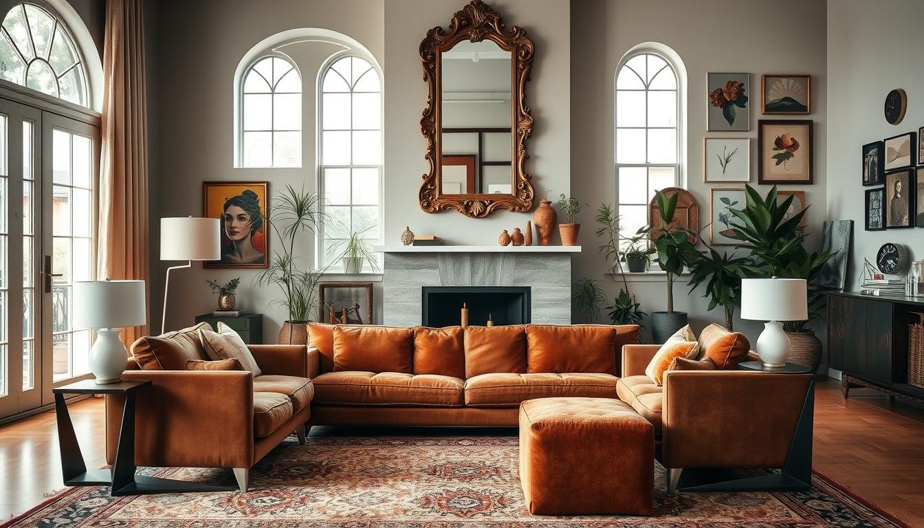
Designing a space that tells a story begins with choosing one hero item. I discovered this when rescuing a 1960s walnut coffee table from a dusty garage sale. Its intricate carvings became my living room’s heartbeat, dictating everything from wall colors to curtain textures.
Using Coffee Tables and Sofas as Anchors
Central placement matters most. That midcentury coffee table now floats between a sleek sectional and industrial bookshelves. Its warm wood tones dialogue with cool metal frames, creating visual tension that energizes the room.
When working with larger spaces, I often opt for upholstered anchors. A camelback sofa from the 1940s anchors my studio apartment. Paired with floating shelves and a hairpin leg desk, it proves historical charm can coexist with contemporary needs.
| Vintage Anchor | Modern Partners | Impact |
|---|---|---|
| Brass coffee table | Acrylic chairs | Creates material contrast |
| Velvet sofa | LED floor lamps | Balances opulence with minimalism |
| Oak cabinet | Glass side tables | Highlights craftsmanship |
Smaller rooms benefit from vertical statements. An art deco bar cart in my kitchen nook draws eyes upward, making ceilings feel higher. Surrounding it with monochrome stools keeps focus on its curved chrome details.
The rule remains constant: let one vintage piece lead. Surround it with quiet supporters that enhance without competing. This approach transforms random furniture into intentional compositions that feel both curated and livable.
Balancing Functionality with Aesthetic Appeal
Nothing teaches design priorities faster than a vintage sofa that feels like a torture device. I learned this the hard way when a gorgeous 1950s sectional left guests bruised from exposed springs. Now, every vintage furniture purchase starts with one question: “Will this piece earn its keep?”

Heavily used items like seating and beds get strict comfort requirements. I’ll reupholster a retro armchair with plush foam, but won’t sacrifice spine health for style. Storage pieces undergo similar scrutiny – drawers must glide smoothly after hardware upgrades. That ornate 1920s dresser? It became a bathroom vanity when its sticky drawers frustrated daily use.
Mid-century designs often strike the best balance. Their clean lines suit contemporary homes while offering sturdier construction than older antiques. My 1960s teak dresser functions flawlessly after replacing worn slides, proving vintage character can coexist with modern practicality.
When restoration can’t fix fundamental flaws, I opt for new furniture that mimics retro charm. My living room’s camelback sofa looks straight from a Parisian flea market but has hidden USB ports and stain-resistant fabric. This hybrid approach keeps spaces livable without losing design personality.
Prioritizing function transformed my approach. Beautiful pieces now serve my family’s needs first – anything less becomes décor rather than daily-use furnishings. The result? A home that works as hard as it charms.
Integrating Modern Lighting and Fixtures
Lighting transformed my rooms from dated to dynamic faster than any other design element. When I swapped a fussy chandelier for a geometric pendant, my dining area shed its “grandma’s attic” vibe overnight. The right fixtures act like jewelry – subtle but essential for completing the look.
Selecting Sleek, Minimalist Fixtures
I hunt for lighting that whispers rather than shouts. Slim black floor lamps frame my 1940s armchair without upstaging its floral upholstery. Track lighting in my kitchen highlights open shelving filled with Depression-era glassware while staying invisible by day.
Neutral finishes work hardest in my strategy. Brushed nickel sconces complement both midcentury brass accents and matte black hardware. This versatility lets me rotate vintage decor without rewiring the room.
Pairing Lighting With Vintage Accents
Directional spots make my favorite finds glow. A focused beam turns a tarnished art deco mirror into a star player. In my bedroom, LED strip lights hidden in a barnwood headboard mix rustic charm with smart home convenience.
| Modern Fixture | Vintage Partner | Effect Created |
|---|---|---|
| Dimmable pendant | Farmhouse table | Warms reclaimed wood tones |
| Adjustable floor lamp | Victorian settee | Highlights intricate carving |
I choose energy-efficient LEDs dressed in simple silhouettes. They provide better task lighting than most antique lamps while letting historical pieces handle the ambiance. The combination means I can actually read books on my 1970s sofa without eye strain.
Applying the 80/20 Rule for Balanced Interiors
Designers whisper about ratios like secret formulas, but I’ve found one rule that never fails. The 80/20 principle transformed my interior from chaotic to curated. By making 80% of my space contemporary and reserving 20% for character-rich finds, rooms feel fresh yet full of soul.

I scatter those special vintage elements like breadcrumbs leading through each room. A midcentury lamp here, an heirloom vase there – this distribution prevents any single area from feeling like a time capsule. Modern sofas and shelving act as quiet supporters, letting history peek through without overwhelming.
The magic lies in applying this ratio across all layers. My living room’s 1950s armchair (20%) floats among neutral pillows and a streamlined coffee table (80%). Even artwork follows the rule – three abstract prints balance one weathered oil painting.
This system saved me from my own enthusiasm. That gorgeous 1930s chandelier? It stayed because the dining area’s clean-lined table and chairs kept the balance. Without strict parameters, I’d live in a museum of abandoned eras.
Your 20% can flex based on room size or architectural style. Small bathrooms might showcase vintage towel racks, while kitchens let antique cutting boards shine. The constant? Modern foundations ensure every design choice feels intentional, not accidental.
Layering Textures for Depth and Interest
Rooms come alive when surfaces tell stories through touch. I discovered texture’s power while rehabbing a 1920s bungalow – its original oak floors felt sterile until layered with a nubby wool rug. That moment taught me dimensional spaces need tactile conversations between eras.
Mixing Rough and Smooth Surfaces
Contrasting materials create visual rhythm. My living room pairs a polished concrete end table with a reclaimed barnwood console. The combo makes both vintage furniture and contemporary accents feel deliberately chosen rather than randomly placed.
Textiles bridge gaps between textures. A buttery leather armchair gets cozy with chunky knit throws, while linen curtains soften industrial shelving. These layers prevent any single element from dominating the space.
| Vintage Texture | Modern Pairing | Effect |
|---|---|---|
| Worn bookcase | Glossy acrylic boxes | Highlights wood grain |
| Hammered brass lamp | Marble side table | Elevates both finishes |
I test combinations by running my hand across surfaces. If a grouping feels too harsh or flat, I add contrasting elements – maybe a velvet pillow on a sleek sofa. This approach builds rooms that invite touch while maintaining design clarity.
Texture layering solved my “museum effect” problem. Now, 1940s side chairs converse with lucite stools through shared ochre tones and opposing surfaces. The result? Spaces that feel curated, not cluttered.
Achieving a Cohesive Look Through Thoughtful Accessories
Accessories are the punctuation marks of home design – small but vital for completing the sentence. I learned their power when a thrifted malachite bowl united my living room’s competing eras. Its green veins echoed modern throw pillows while complementing a 1940s landscape painting.
Curating these finishing touches requires restraint. I limit displays to three related items per surface. A brass tray might hold both wireless chargers and heirloom candlesticks. This approach lets accessories bridge time periods without creating clutter.
Textural contrast elevates simple arrangements. Rough linen napkins look intentional beside smooth ceramic vases. A sleek console table gains warmth from a hand-carved wooden box. These pairings create depth through touchable variety.
My golden rule? Let every decorative piece serve double duty. That art deco bookend organizes magazines while adding flair. Accessories earn their keep when they balance beauty with purpose, proving details make the design.
 using WordPress and
No responses yet