This post may contain affiliate links. When you purchase through links on our site, we may earn an affiliate commission.
What if your home’s first impression could transport guests to the golden age of glamour? I discovered that blending the bold geometric patterns and sleek symmetry of the 1920s with modern practicality creates spaces that feel both timeless and fresh. Let me show you how to turn ordinary foyers into jaw-dropping statements.
When I redesigned my own entry, I focused on contrasts: sharp angles paired with metallic accents, rich jewel tones balanced by crisp whites. The luxurious materials like polished chrome and lacquered wood became my foundation. But it’s not just about looks—every choice serves a purpose, from mirrored surfaces that amplify light to streamlined furniture that keeps clutter at bay.
This style thrives on confidence. Think sunburst motifs in lighting fixtures or zigzag floor tiles that guide the eye forward. I’ll walk you through how to mix these iconic elements without overwhelming your space. Because true sophistication lies in balance—not excess.
Key Takeaways
- Merge vintage glamour with modern functionality using geometric shapes and metallic finishes
- Use high-contrast color schemes to create instant visual impact
- Incorporate reflective surfaces like mirrors to enhance natural light
- Select statement lighting fixtures as focal points
- Prioritize clean lines and symmetry for cohesive design
Introduction: Embracing Art Deco Elegance in My Entryway
Walking through my front door became a daily revelation when I began merging timeless sophistication with contemporary flair. The moment I embraced this design philosophy, my space transformed into a curated experience—one that whispers “welcome” through every carefully chosen detail.
What excites me most about art deco design is its fearless personality. I channel this energy by balancing angular shapes with plush textures—think a hexagonal console table against velvet-upholstered stools. This approach lets me honor the 1920s spirit while keeping my interior design functional for modern living.
Three principles guide my creative process:
- Geometric boldness: Chevron-patterned floors create movement
- Material contrast: Polished nickel meets matte black finishes
- Controlled drama: A single sunburst mirror instead of cluttered decor
My foyer proves vintage charm and minimalism aren’t enemies. By editing elements rather than eliminating them, I achieve that perfect deco balance—enough nostalgia to intrigue, enough simplicity to feel current. The result? A gateway that doesn’t just connect rooms, but eras.
As we explore specific ideas ahead, you’ll see how historical motifs can solve modern design challenges. From lighting choices that sculpt shadows to color pairings that redefine “neutral,” let’s unlock the secrets of art deco theme mastery together.
The Legacy of the Roaring ’20s and Art Deco Design
The 1920s weren’t just about jazz and flappers—they birthed a design revolution that still shapes our spaces today. As I studied this era, I realized how post-war optimism fueled a hunger for bold statements. Art Deco became the visual language of progress, marrying machine-age sleekness with handcrafted luxury.
Iconic skyscrapers like the Chrysler Building taught me the power of streamlined forms. Their zigzag terraces and sunburst spires weren’t just architecture—they were declarations of human ambition. That’s why I still use stepped patterns in my console tables and angular sconces.
What fascinates me most is how deco design balanced opulence with function. The era’s chrome-accented elevators and geometric floor mosaics served practical needs while radiating glamour. I channel this duality by pairing metallic drawer pulls with minimalist storage benches.
Today’s interiors echo this legacy through high-contrast palettes and timeless symmetry. My own foyer’s chevron tiles nod to 1920s innovation while fitting seamlessly into modern life. It’s proof that great design transcends eras—it just needs a fresh perspective.
Art Deco-Inspired Entryways: Key Ideas for Elegance
I discovered that true deco elegance isn’t about excess—it’s strategic curation. The magic happens when luxurious materials like polished marble meet angular brass accents, creating spaces that feel both opulent and intentional.
https://www.youtube.com/watch?v=yNykj86V0rI
My approach centers on three non-negotiables: geometric motifs that command attention, high-contrast textures for depth, and fixtures that double as sculptures. A sunburst chandelier above a trapezoidal console table demonstrates how deco elements can anchor a room while serving practical needs.
Balance is everything. I pair bold zigzag wallpaper with monochromatic artwork to prevent visual chaos. Even small touches matter—chrome drawer pulls on a lacquered cabinet add luxury without overwhelming the senses.
Want to capture this art deco theme? Start with one statement piece, like a tiered lighting fixture, then build around it using symmetrical layouts. Remember: every choice should whisper “timeless” while shouting “personality.”
Signature Geometric Patterns and Shapes
Geometric design isn’t just decoration—it’s visual storytelling. When I experimented with angular forms in my foyer, I realized how lines and shapes could direct energy while anchoring the space. These elements became my secret weapon for creating rhythm without clutter.
Bold Geometric Wallpapers and Floor Designs
Nothing transforms walls faster than hexagonal or chevron-patterned wallpaper. I once used a black-and-gold triangular print behind my console table—it instantly became the room’s heartbeat. For floors, I prefer marble tiles arranged in fan-shaped geometric patterns that mimic 1920s hotel lobbies.
Here’s my golden rule: pair busy geometric shapes with solid counterparts. A zigzag rug looks intentional when balanced by a plain velvet bench. This approach keeps spaces lively yet grounded.
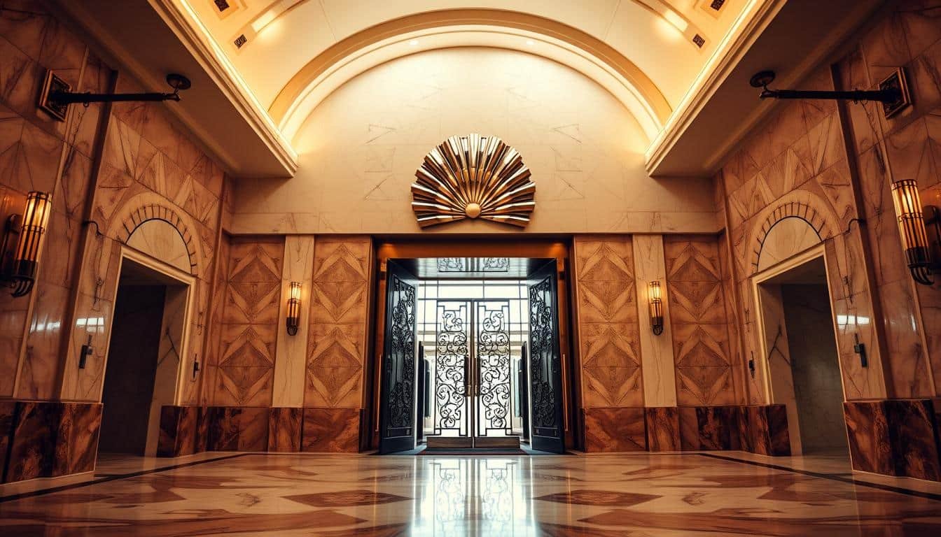
Sunburst and Zigzag Motifs Explored
Sunburst mirrors taught me the power of radial symmetry. Their rays stretch outward like metallic sunbeams, making narrow entries feel expansive. Zigzag details work similarly—I’ve used them in stair railings to guide movement toward living areas.
These deco style staples aren’t just pretty—they solve problems. A sunburst clock above the door hides awkward wall proportions, while diagonal floor tiles disguise uneven surfaces. It’s functional artistry at its finest.
As one architect friend said:
“Geometrics turn architecture into choreography.”
That’s exactly what happens when you letpatternslead the dance in your home’s opening act.
Play With Bold Color Palettes
Color became my secret weapon for transforming bland spaces into dramatic introductions. A well-chosen palette doesn’t just decorate—it orchestrates emotions. Rich tones set the stage, while strategic contrasts keep eyes dancing across details.
Deep Hues & Vibrant Contrasts
I lean into jewel tones like sapphire blue and emerald green for their instant drama. Pair them with metallic gold or silver accents, and you’ve got bold colors that command attention. My go-to combo? Deep burgundy walls with brass light fixtures—it’s pure 1920s opulence made modern.
Balance is key. I offset daring shades with soft neutrals: think charcoal gray trim around crimson doors. This approach lets colors shine without overwhelming. For floors, I love black-and-white checkerboard tiles—they sharpen lines while nodding to classic motifs.
| Era-Inspired Pairings | Modern Twist | Best Use |
|---|---|---|
| Emerald & Gold | Teal & Rose Gold | Accent walls |
| Onyx & Ivory | Charcoal & Oatmeal | Floor patterns |
| Ruby & Chrome | Merlot & Nickel | Lighting fixtures |
Want to test vibrant contrasts? Try a lacquered red console against dove gray walls. The pop of color energizes the space while letting geometric decor take center stage. Remember: your palette should enhance—not fight—your style essentials.
Pro tip: Use sample swatches at different times of day. That perfect midnight blue might read as navy under morning light but transform into pure drama by sunset.
Luxurious Materials and Finishing Touches
Materials whisper stories of luxury the moment your hand brushes against them. In my home, this narrative unfolds through deliberate pairings—soft textures kissing cool metals, warm glows dancing across reflective surfaces. These choices transform ordinary moments into sensory experiences.

Velvet Textiles and Metallic Accents
I fell hard for velvet’s whisper-soft embrace. A sapphire-blue bench cushion became my entry’s tactile centerpiece, its plush surface contrasting with angular chrome legs. This marriage of sumptuous fabric and industrial accents captures that perfect tension between comfort and edge.
Metallic details elevate everything they touch. I’ve used hammered nickel drawer pulls on a charcoal console—their irregular surfaces catching light like disco balls. For walls, try geometric bronze sconces flanking a matte black mirror. The play of textures here is pure alchemy.
Brass Details and Golden Finishes
Nothing says timeless luxury like brass. I designed floating shelves with thin gold trim that glows against walnut veneers. Even small touches matter—a gilded key tray by the door adds function while nodding to 1920s opulence.
| Material Pairings | Modern Application | Visual Effect |
|---|---|---|
| Velvet + Brass | Bench seating | Warm contrast |
| Lacquered Wood + Gold Leaf | Tabletop decor | Depth through sheen |
| Marble + Polished Nickel | Console bases | Cool elegance |
These luxurious materials work hardest when they converse. My favorite trick? Layering a mercury glass vase atop a emerald-green velvet runner. The combo whispers “grand hotel lobby” while keeping things fresh. Remember: true luxury lives in thoughtful combinations, not just expensive items.
Crafting Statement Lighting and Mirrors
Lighting became my unexpected ally in redefining first impressions. When I realized how fixtures could sculpt shadows and spotlight bold geometric patterns, my approach to illumination shifted from practical to artistic. The right combination of layered lighting transforms blank walls into dynamic canvases.
Layered Lighting and Sculptural Fixtures
I start with a trio of light sources: overhead pendants for general glow, wall sconces for ambient warmth, and table lamps for focused pools. My favorite setup? A tiered brass chandelier hovering above a trapezoidal mirror—its reflections multiply the lights’ impact without extra bulbs.
Mirrors taught me spatial alchemy. Placing an angular, floor-length mirror opposite windows doubled natural brightness in my narrow hallway. For smaller spaces, I cluster circular mirrors in geometric arrangements to create illusionary depth.
“Lighting design isn’t just visibility—it’s visual punctuation.”
Sculptural fixtures serve dual roles. A cantilevered sconce with clean lines becomes both task light and wall art. I’ve used asymmetrical floor lamps resembling abstract sculptures to guide guests toward living areas.
| Lighting Type | Function | Style Impact |
|---|---|---|
| Sunburst Chandelier | Ambient lighting | Retro glamour |
| Linear Sconces | Accent lighting | Modern edge |
| Dome Pendants | Task lighting | Soft focus |
Balance remains crucial. I pair ornate statement pieces with minimalist furnishings—like a faceted crystal lamp atop a streamlined console. This interplay keeps spaces feeling curated, not crowded. The magic lies in letting each element shine without competition.
The Influence of Mirrors and Terrazzo in Entryway Design
Mirrors became my secret weapon for transforming cramped spaces into grand introductions. When I installed a floor-length mirror with beveled edges opposite my front door, it doubled the perceived square footage instantly. Pairing this with terrazzo flooring—speckled with quartz and marble chips—created a foundation that feels both expansive and historically grounded.
Strategic placement makes all the difference. I angle mirrored surfaces to catch morning light, bouncing sunshine deeper into my home. For evening drama, I position them near sconces to amplify their golden glow. This technique turns functional reflections into intentional style statements.
Terrazzo floors surprised me with their versatility. The composite material’s random patterns hide scuffs while adding subtle texture. I chose a gray-and-white blend with brass flecks—a modern twist on classic 1920s design. Unlike uniform tiles, each step tells a unique visual story.
Completing the look required careful accents. I landed on these pairings:
| Element | Material Choice | Impact |
|---|---|---|
| Console Table | Smoked glass | Enhances reflections |
| Door Hardware | Brushed nickel | Echoes terrazzo flecks |
| Entry Rug | Geometric jute | Grounds the space |
These components work together like orchestra sections—the mirrors conduct light, terrazzo provides rhythm, and metallic details add crescendos. The result? A welcoming gateway that feels polished yet approachable, proving smart interior design choices can make even modest entries sing.
Building Functionality: Built-ins and Architectural Arches
Great design marries form with function—a principle I embraced when reinventing my space’s architectural bones. By blending practical storage with striking silhouettes, I created features that work as hard as they impress.

Integrating Built-in Bookshelves and Storage
Custom shelving became my secret weapon. Flanking my doorway, recessed units with geometric shapes hold keys and display curated objects. The trick? Aligning shelf heights to create rhythmic negative space—like musical rests between furniture notes.
For narrow walls, I designed vertical cabinets with brass-trimmed doors. Their slim profiles maximize storage without crowding walkways. Pairing matte black exteriors with mirrored interiors adds depth while hiding clutter.
| Traditional Built-ins | Modern Adaptation | Style Impact |
|---|---|---|
| Wood paneling | Lacquered MDF | Sleek surfaces |
| Ornate corbels | Angular brackets | Streamlined support |
| Closed storage | Glass-front cabinets | Visual lightness |
Elegant Arch Accents and Framed Doorways
Arches transformed flat openings into architectural statements. I softened a angular hallway with a curved plaster archway—its gentle sweep balancing the space’s sharp lines. For added drama, I backlit it with recessed lights that cast shadow patterns at dusk.
Framed doorways anchor sightlines. My favorite project involved wrapping a threshold in fluted wood molding. The vertical grooves echo nearby geometric wall patterns while guiding eyes toward a sunburst mirror.
“Architectural details are your home’s punctuation marks—they tell guests where to pause and marvel.”
Every detail serves dual purposes. Bronze door handles double as sculptural accents, while a floating bench under my arch provides seating and shoe storage. It’s proof that smart furniture choices can honor history while solving modern needs.
Bringing in Texture: Ribbed, Fluted, and Patterned Surfaces
Texture became my silent collaborator in crafting spaces that beg to be touched. While bold patterns catch the eye, it’s the tactile dance of surfaces that truly elevates a design. I discovered this when running my hand along a fluted console table—its vertical grooves created rhythm where flat planes felt sterile.
Ribbed textures work magic on walls and furnishings. I lined my hallway with vertically striped paneling, its subtle shadows making narrow spaces feel taller. For furniture, I favor rounded fluting on cabinet doors—a soft counterpoint to angular decor.
Patterned surfaces add surprise without chaos. My favorite trick? Wallpapering the back of open shelving with a hexagonal print. It peeks through displayed objects like a hidden detail, creating depth without overwhelming.
| Texture Pairing | Application | Effect |
|---|---|---|
| Ribbed + Smooth | Door panels | Visual rhythm |
| Fluted + Matte | Light fixtures | Soft diffusion |
| Patterned + Solid | Accent walls | Focal contrast |
Balance remains crucial. I anchor busy textures with clean lines—like pairing a chevron-patterned rug with a streamlined bench. As designer Ilse Crawford notes:
“Texture is the unsung hero that turns rooms into experiences.”
My golden rule? Let one textured element shine while others play supporting roles. A ribbed vase atop a lacquered table achieves that perfect touch of dimension—proof that restraint amplifies impact.
Incorporating Modern Technology with Deco Details
Who says vintage glamour can’t embrace smart living? I found that technology enhances design when treated as another element rather than an intrusion. The key lies in camouflaging gadgets within classic silhouettes—think touchpad controls hidden behind brass inlays or motion sensors framed by fluted wood.
Seamless Integration of Smart Amenities
My entryway’s voice-controlled lighting hides in plain sight. Geometric-patterned sconces with built-in LEDs respond to whispers while mimicking 1920s craftsmanship. Even climate controls get a luxurious materials makeover—I embedded a marble touch panel into my console table, its veining disguising the tech.
Subtlety rules. I replaced clunky switches with slim gold-plated dials that adjust brightness levels. They nestle between geometric patterns on my wallpaper like intentional accents. For security, a fingerprint reader doubles as decorative door hardware—its circular shape echoing sunburst motifs.
| Deco Feature | Tech Integration | Visual Impact |
|---|---|---|
| Chevron Molding | Hidden Motion Sensors | Clean lines preserved |
| Sunburst Mirror | Smart Camera Disguise | Focal point maintained |
| Lacquered Panels | Wireless Charging Surface | Seamless functionality |
As smart home expert Lena Petrov notes:
“True innovation disappears into the interior landscape.”
This philosophy guides my choices. I pair bronze voice assistants with velvet trays, letting style and substance share the spotlight. The result? Spaces that honor history while whispering to the future.
Curating Decorative Accents and Art Pieces
Every decorative piece in my home’s entrance whispers intention. I treat accents like punctuation marks—they should emphasize, not overwhelm. My rule? If it doesn’t spark joy and align with the design narrative, it doesn’t earn shelf space.
When selecting art, I chase boldness over subtlety. A framed cubist print with angular gold leaf became my entry’s conversation starter. For sculptures, I lean into materials that catch light—polished onyx bookends or a bronze figurine with geometric edges. These pieces nod to deco’s daring spirit without feeling like museum replicas.
Furniture doubles as functional art in my space. A lacquered console table with zigzag marquetry serves as both storage and statement. I balance it with simpler furniture—like a streamlined bench upholstered in emerald velvet. This contrast lets each piece shine while maintaining harmony.
| Traditional Deco Accents | Modern Interpretation | Impact |
|---|---|---|
| Crystal obelisks | Faceted glass vases | Light refraction |
| Gilded frames | Brass-edged mirrors | Warm reflections |
| Ivory figurines | Ceramic geometric forms | Tactile interest |
As designer Jonathan Adler advises:
“Accessories are the jewelry of your space—choose them like you’re dressing for impact.”
I apply this by mixing matte and glossy finishes on adjacent shelves. A single mercury glass vase beside a rough-textured urn creates that perfecttouchofopulence.
Every choice reinforces the story. Even my mail tray—a hammered brass rectangle with geometric patterns—feels deliberate. It’s proof that curation isn’t about quantity, but about creating visual echoes between objects.
Mixing Old-World Charm with Contemporary Style
Blending eras isn’t about choosing sides—it’s crafting conversations between periods. My favorite projects balance warmth from vintage details with crisp modern lines. The secret? Treating historical references as accents rather than blueprints.
Tips for Achieving a Harmonious Blend
Start with texture pairings. I layer plush rugs under angular furniture to soften geometric shapes. A velvet ottoman in emerald green beneath a chrome-edged table creates this effect perfectly—cozy meets cutting-edge.
Wall treatments bridge time gaps effortlessly. Try wallpaper with subtle damask prints alongside floating shelves. The traditional pattern feels fresh when contrasted with minimalist storage. For bold colors, I use navy accent walls as backdrops for abstract metal sculptures.
| Vintage Element | Modern Counterpart | Design Impact |
|---|---|---|
| Floral wallpaper | Geometric light fixture | Balanced contrast |
| Carved wood frame | Acrylic console table | Material tension |
| Brass sconces | LED strip lighting | Layered illumination |
Lighting ties everything together. I mix tiered chandeliers with recessed spots—the former nods to history, the latter keeps things current. As designer Mara Santos notes:
“Mixing periods requires respect for both histories—let each element speak without shouting.”
Finally, edit ruthlessly. One heirloom mirror deserves space to shine against clean walls. This restraint lets every era in your design feel intentional, not accidental.
My Personal Journey in Designing an Art Deco Entryway
Balancing vintage glamour and daily life became my unexpected design obsession. It started with a salvaged 1930s chandelier—its geometric arms whispering stories of jazz-age soirées. I realized modern spaces could honor history without becoming museums.
The toughest challenge? Merging luxurious materials with family-friendly durability. My breakthrough came with stain-resistant velvet—a sapphire bench cushion that withstands backpacks while radiating art deco charm. Custom furniture pieces bridged eras, like a trapezoidal console with laser-cut brass inlays.
Three lessons shaped my approach:
- Geometric patterns need breathing room—pair bold tiles with solid walls for a cohesive aesthetic
- Lighting dictates mood (I swapped harsh LEDs for amber-toned bulbs)
- Every functional element can be beautiful (even coat hooks became brass sculptures)
My favorite triumph? A terrazzo floor embedded with recycled glass chips—durable enough for dogs, dazzling enough for gala guests. It proves art deco aesthetic principles adapt beautifully to real life.
“Good design isn’t about perfection—it’s about creating moments that make you pause and smile.”
Ready to start your journey? Begin with one statement piece that makes your heart race. The rest will follow.
Final Thoughts and Future Visions
Future-forward design doesn’t erase history—it reinterprets it with fresh eyes. My journey blending deco style elements with contemporary needs revealed how spaces can honor the past while evolving. The interplay of geometric patterns and smart material choices creates rooms that feel both nostalgic and innovative.

Mixing 1920s grandeur with modern minimalism taught me balance is key. I now pair lacquered wallpaper with clean-lined furniture, letting each era’s strengths shine. This approach keeps spaces feeling curated rather than dated—a lesson I’ll carry into future projects.
Looking ahead, I’m excited to push boundaries:
- Experimenting with lighting that projects dynamic geometric shadows
- Integrating sustainable materials into classic art deco silhouettes
- Developing color palettes that reinterpret jazz-age opulence for modern eyes
| 1920s Feature | Modern Adaptation | Impact |
|---|---|---|
| Gold Leaf Ceilings | Brass Accent Walls | Warm Reflection |
| Stained Glass | Prismatic Acrylic Panels | Light Play |
| Geometric Wallpaper | 3D Textured Panels | Tactile Interest |
As designer Elena Torres notes:
“The future of art deco lies in its adaptability—honoring structure while embracing new narratives.”
I encourage you to start small but think big. Try a single deco style mirror with LED framing, or refresh tired walls with angular stencils. Every experiment keeps this design philosophy alive and relevant.
What vision will you create? Whether reviving heirloom pieces or reimagining colors, remember: great spaces whisper stories across generations. Now’s your moment to write the next chapter.
Conclusion
Transforming your home’s entrance into a bold statement doesn’t require a time machine. Through strategic use of clean lines, geometric shapes, and metallic finishes, you can craft spaces that honor the art deco spirit while meeting modern needs. The magic lies in balancing sharp angles with soft textures and letting key elements—like brass sconces or tiered lighting—steal the show.
Remember: this deco style thrives on confidence, not clutter. A single sunburst mirror or streamlined console can channel 1920s grandeur without feeling costume-like. Mix jewel tones with neutral backdrops to let colors pop, and use reflective surfaces to amplify natural light.
Ready to reimagine your space? Start small—swap basic hooks for geometric brass ones, or introduce a chevron-patterned rug. Every choice adds layers of warmth and sophistication. Have questions about blending eras or selecting statement pieces? Let’s keep the conversation going. Your journey toward a timeless entryway begins with one daring design choice.
FAQ
How do I start incorporating Art Deco elements into my entryway?
What color palettes work best for a 1920s-inspired entryway?
Can I mix modern technology with Art Deco design without clashing?
Are mirrors essential for achieving an Art Deco aesthetic?
How do I balance bold patterns without overwhelming a small entryway?
What materials should I prioritize for an authentic Deco feel?
Can I blend contemporary furniture with Art Deco architecture?


 using WordPress and
No responses yet