This post may contain affiliate links. When you purchase through links on our site, we may earn an affiliate commission.
What if your bedroom could quietly transform stress into stillness with just a few design choices? This question guided me as I reimagined my space to merge thoughtful minimalism with organic warmth—a balance at the heart of blending Japanese and Scandinavian principles.
I discovered that stripping away clutter doesn’t mean sacrificing comfort. Instead, it creates room for textures like linen bedding and handcrafted ceramics to shine. Designers like Emily Minton Redfield emphasize how neutral palettes paired with raw wood grains foster tranquility—a concept I tested firsthand.
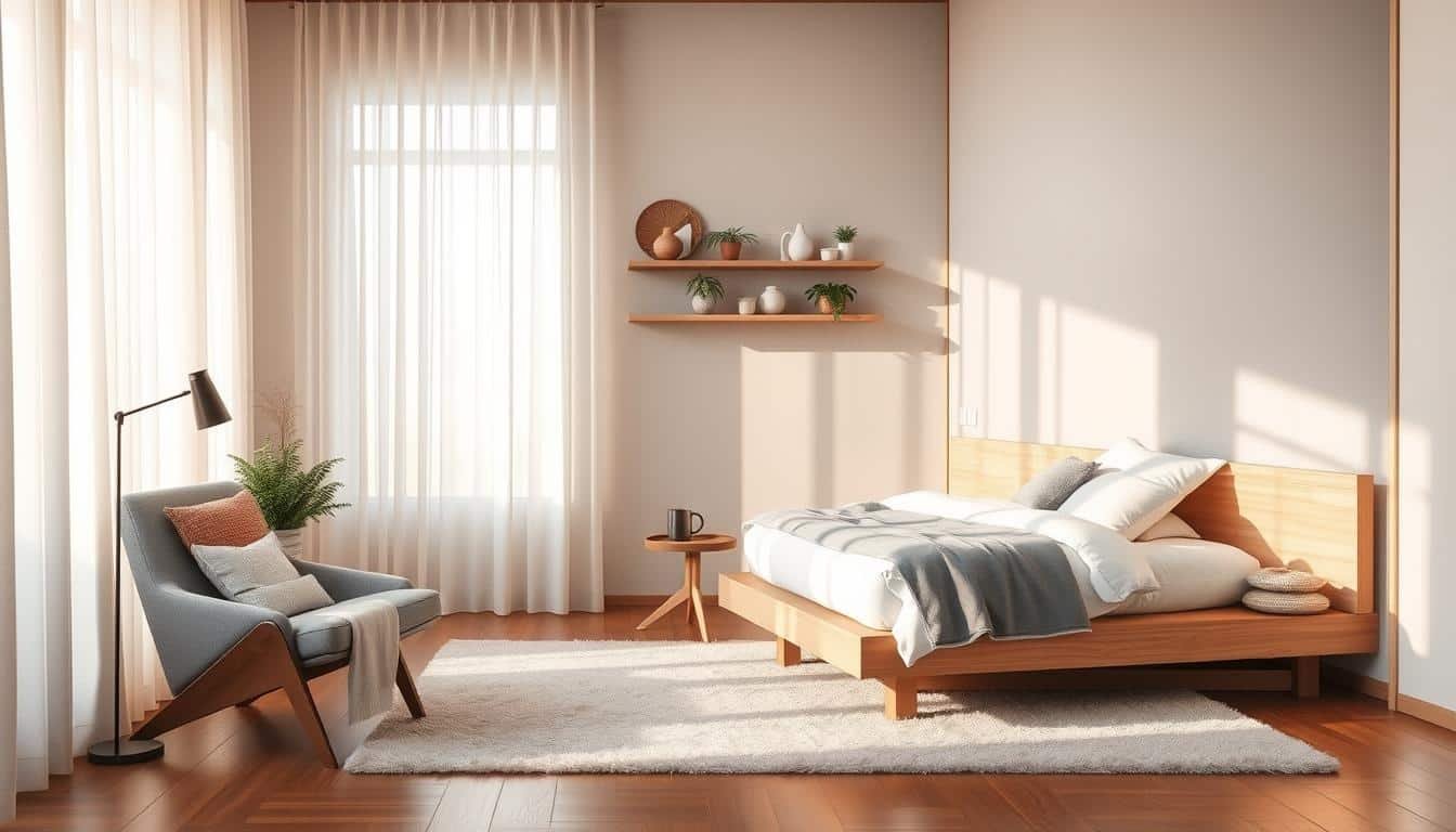
My vision centered on quality craftsmanship: smooth oak nightstands, a low-profile platform bed, and woven rattan accents. These elements don’t just look good—they anchor the room in nature’s rhythms. Light plays a key role too, with layered lighting mimicking Scandinavia’s soft daylight.
Key Takeaways
- Blending Japanese and Scandinavian design creates balance through simplicity and warmth
- Natural materials like wood and linen enhance calmness without sacrificing style
- Clean lines and quality woodwork form the foundation of a restful space
- Neutral color schemes help maintain visual harmony and mental clarity
- Strategic lighting choices amplify the room’s serene atmosphere
In the following sections, I’ll share practical ways to bring this philosophy into your own space—from selecting sustainable furniture to arranging decor with intention. Let’s create a retreat that doesn’t just look peaceful but feels genuinely restorative.
Setting the Stage: Understanding Japandi Style Bedroom Inspiration
Have you ever wondered how two distinct cultures could create a unified design language? My exploration began when I noticed designers like Frederik Werner describing this blend as “mindful curation meeting functional artistry.” At its core, this approach celebrates harmony through restraint—a concept I’ve tested in my own space.
What Defines Japandi Aesthetics?
This philosophy merges Japanese wabi-sabi (embracing imperfection) with Scandinavian hygge (comfort through simplicity). Truss Interiors’ team explains it as “eliminating excess to highlight quality craftsmanship.” In practice, this means:
- Uncluttered layouts with breathing room
- Organic textures like unvarnished wood or stone
- Neutral backdrops softened by tactile fabrics
The Fusion of Japanese Minimalism and Scandinavian Simplicity
Norm Architects’ projects show how both traditions prioritize practicality. Japanese design focuses on intentional emptiness, while Scandinavian spaces use light manipulation to enhance coziness. Here’s how they complement each other:
| Element | Japanese Influence | Scandinavian Touch |
|---|---|---|
| Materials | Raw, untreated surfaces | Pale woods & wool blends |
| Color Palette | Earthy ochres & deep indigos | Muted grays & creamy whites |
| Functionality | Multi-use built-ins | Streamlined storage solutions |
Emily Minton Redfield notes that successful blends “let materials speak louder than decorations.” In my bedroom, this meant choosing a hand-carved ash bedframe paired with linen curtains—proof that opposites can create balance.
Embracing Neutral and Natural Tones
The magic of a calming space often starts with its color story. I learned this while studying Julee Wray’s work at Truss Interiors, where she layers warm neutrals with earthy browns and muted greens. Her approach proves that a restrained palette can feel inviting when anchored in nature’s hues.
https://www.youtube.com/watch?v=K8VQhP1J3gM
Incorporating Warm and Organic Hues
Start with a base of creamy whites or soft grays—these act as blank canvases. Then, introduce depth through materials like clay pots or oak furniture. I found that pairing flaxen linen bedding with terracotta accents creates warmth without overwhelming the senses. As Wray notes, “Natural textures add richness even in monochromatic spaces.”
Balancing Deep Browns, Blues, and Soft Greens
Contrast is key. A slate-blue throw pillow pops against caramel-toned wood, while sage-green ceramics complement pale walls. Here’s a formula I tested:
| Base Tone | Accent Color | Effect |
|---|---|---|
| Warm White | Burnt Umber | Grounds the space |
| Pebble Gray | Moss Green | Adds freshness |
| Oatmeal | Indigo | Creates focal points |
Stick to 3-4 main tones to maintain harmony. In my own home, I used weathered oak shelves (brown), seagrass baskets (green), and stonewashed cotton curtains (blue-gray). This mix feels cohesive yet dynamic—proof that nature’s palette works effortlessly indoors.
Incorporating Natural Materials for a Tranquil Feel
The quiet power of natural materials became clear when I replaced synthetic decor with raw wood elements. Emily Minton Redfield’s advice stuck with me: “Let the grain tell the story, not the finish.” This philosophy transformed my space into an earthy sanctuary where every surface feels alive.
Utilizing Raw Wood and Sustainable Options
I discovered that untreated surfaces add authentic character. My reclaimed oak nightstands from Truss Interiors showcase subtle knots and color variations—proof that imperfections create charm. Sustainable choices like bamboo flooring or cork stools reduce environmental impact while maintaining warmth.
Mixing Wood Tones for Visual Interest
Contrasting textures prevent monotony without clutter. Here’s my tested formula:
| Wood Type | Use Case | Effect |
|---|---|---|
| Ash | Bed frame | Adds structured elegance |
| Walnut | Floating shelves | Introduces rich contrast |
| Pine | Decorative bowls | Softens sharp edges |
Morning light plays beautifully across these surfaces, highlighting unique patterns. For cohesive blending:
- Limit to 3 complementary tones
- Repeat one wood type in multiple pieces
- Pair smooth finishes with rough-cut accents
Local artisans became my go-to for ethically sourced materials. A handcrafted cedar bench now anchors the room, its earthy scent enhancing the calming atmosphere. Natural elements don’t just look good—they reconnect us to outdoor rhythms indoors.
Layering Textures and Patterns
Texture became my secret weapon when I realized flat surfaces were draining the room’s energy. At Truss Interiors, I saw how a linen-clad wall paired with a chunky knit throw could make minimalism feel inviting rather than sterile. Their designers taught me that contrast creates character without clutter.

Soft Meets Structured
I balance plush fabrics with raw materials for tactile harmony. My go-to formula:
| Material Type | Use Case | Effect |
|---|---|---|
| Brushed Linen | Duvet cover | Adds relaxed softness |
| Handwoven Jute | Area rug | Grounds the space |
| Hammered Ceramic | Bedside lamp | Introduces subtle shine |
Truss’s cloth mural project showed me how dimensional wall art adds depth. I replicated this with a woven tapestry behind my bed—it’s artwork you can feel.
Strategic Pattern Play
Quilted comforters became my favorite tool for visual rhythm. Here’s how I keep it cohesive:
- Use one bold pattern (geometric quilt) as the hero piece
- Pair with micro-textures like ribbed pillowcases
- Repeat colors across materials for unity
My indigo-dyed throw blanket mirrors the tapestry’s blue undertones, creating a quiet dialogue between pieces. The light dances differently on each surface at dawn—proof that layered textures make stillness dynamic.
Maximizing Natural Light and Open Space
Erin Roberts, a designer specializing in mindful interiors, once told me: “Daylight isn’t just a design element—it’s the soul of a room.” Her words reshaped how I approached my space. I realized that strategic light management could make even compact areas feel expansive and calm.
Techniques for Capturing Abundant Daylight
I tested three methods to amplify sunlight:
- Sheer linen curtains that filter light without blocking it
- Mirrored surfaces placed opposite windows to bounce illumination
- Furniture with slim profiles to avoid casting shadows
Roberts’ open floor plan philosophy guided my layout choices. Removing bulky dressers and opting for under-bed storage created breathing room. Here’s how different adjustments impact atmosphere:
| Change | Light Gain | Space Perception |
|---|---|---|
| Floor-to-ceiling curtains | +40% brightness | Taller ceilings |
| Clear acrylic chair | +15% reflection | Airier feel |
| Wall-mounted sconces | Evening glow | Depth enhancement |
Maintaining clean lines in furniture design proved crucial. My platform bed’s straight edges prevent visual clutter, while floating shelves keep walls looking uncluttered. For harmony, I balance empty zones with functional clusters—like a reading nook by the window.
Pro tip: Declutter weekly. Even beautifully designed rooms feel cramped with stray items. Now, morning light washes evenly across surfaces, making the space feel twice as large as its square footage suggests.
Japandi Style Bedroom Inspiration: My Top Tips for a Serene Retreat
I discovered true relaxation when I swapped my cluttered nightstands for smooth walnut slabs. Daytrip Studio’s lead designer once told me: “Your bed isn’t just furniture—it’s the anchor of your daily reset.” This insight reshaped how I approach bedroom design, focusing on pieces that blend comfort with quiet beauty.

Personal Experiences and Must-Try Ideas
Start with your bed frame—it sets the room’s tone. After testing seven options, I found low-profile designs in oak or ash create grounding energy. Pair with organic linen sheets and a wool throw for instant warmth. My current setup uses a platform bed with hidden storage, proving functionality can be seamless.
These three changes made the biggest impact in my space:
| Element | Material | Effect |
|---|---|---|
| Bed Base | Reclaimed teak | Adds earthy character |
| Lighting | Paper pendant lamps | Softens shadows |
| Textiles | Braided jute rug | Enhances tactile feel |
Keep surfaces clear but curated. A handmade ceramic vase on my dresser holds dried grasses—simple, meaningful, and easy to refresh seasonally. Daytrip’s team recommends “editing until each item earns its place,” which I practice monthly.
For quick transformations, try these ideas:
- Layer sheepskin over your existing bedding
- Swap overhead lights for dimmable table lamps
- Introduce one artisanal piece like a carved stool
Your space should feel like a warm embrace, not a showroom. My linen-curtained reading nook cost under $100 but delivers daily joy. Remember: serenity thrives where purpose meets poetry in design.
Functional and Multipurpose Design Elements
Creating a sanctuary that adapts to daily life became my priority after realizing how often spaces sit unused. Freddie Marriage’s approach to guest rooms taught me that smart design serves multiple purposes while maintaining visual calm. By blending Scandinavian practicality with Japanese spatial awareness, I discovered ways to make every inch intentional.
Curating Spaces for Rest and Versatility
Marriage’s projects show how a single room can transition from sleeping quarters to a meditation zone. I tested this with a platform bed featuring built-in drawers—perfect for storing yoga mats or extra linens. Designers like Erik Munro emphasize “zoning through material changes,” which I applied using a wool rug to define my reading nook.
| Feature | Scandinavian Approach | Japanese Principle |
|---|---|---|
| Daybed | Tufted upholstery for lounging | Tatami mat base for flexibility |
| Shelving | Open birch units | Recessed alcoves |
| Lighting | Adjustable floor lamps | Shoji screen diffusion |
Streamlining Storage without Compromising Style
Munro’s cabinet designs inspired my wall-mounted nightstand—it holds books and a lamp while floating above the floor. For small items, I use woven baskets that complement my linen bedding. Three principles guide my storage choices:
- Hide daily essentials behind sliding panels
- Display only items that spark joy (as per Japanese tokonoma displays)
- Use vertical space with floor-to-ceiling shelving
My favorite trick? Converting an antique trunk into a coffee table with hidden blanket storage. This approach proves that functional design can be both beautiful and purposeful, honoring both traditions’ emphasis on practicality.
Infusing Artistic Accents for a Personal Touch
Art became my bridge between minimalism and self-expression when redesigning my space. Daytrip Studio’s team shared a golden rule: “Every decorative piece should whisper your story, not shout for attention.” This philosophy helped me curate accents that feel intentional yet deeply personal.

Using Statement Wall Art and Custom Murals
Large-scale artwork adds depth without clutter. I chose an abstract linen canvas with organic shapes, its muted tones blending with my neutral walls. For smaller rooms, Daytrip recommends vertical pieces that draw the eye upward, creating the illusion of height.
Choosing Minimalist Decorative Pieces
I limit display items to three meaningful pieces per surface. A hand-thrown ceramic bowl holds my favorite river stones, while a sculptural walnut stool doubles as a side table. These functional art furniture elements blend seamlessly with the room’s clean lines.
Integrating Nature-Inspired Graphics
Botanical prints framed in raw wood bring outdoor serenity indoors. My favorite bedroom ideas include:
- Framed pressed leaves arranged in grid patterns
- Indigo-dyed fabric panels with wave motifs
- Slatted wood screens casting shadow patterns
Daytrip’s designers suggest rotating seasonal accents to keep the space feeling fresh. I swap my autumn branch arrangement for spring cherry blossoms—tiny changes that anchor the room in nature’s rhythm while honoring minimalist principles.
Balancing Minimalism with Warmth and Coziness
Cathie Hong once described minimalist spaces as “blank canvases waiting for life’s brushstrokes.” This insight reshaped how I approach bedroom design—proving that sleek lines and raw materials can coexist with inviting comfort when layered thoughtfully.
Curating a Serene Color Palette and Soft Furnishings
Reynard Lowell’s projects taught me that warmth emerges through textured neutrals. I tested his three-layer formula:
| Layer | Material | Purpose |
|---|---|---|
| Base | Oatmeal linen walls | Creates calm backdrop |
| Mid | Wool-blend throw | Adds tactile softness |
| Accent | Clay-dyed pillowcases | Introduces earthy depth |
Hong recommends “choosing one hero texture per zone.” In my space, a nubby bouclé chair anchors the reading corner while smooth cotton bedding maintains visual rest. This balance keeps the atmosphere airy yet grounded.
Three strategies help merge minimalism with coziness:
- Use organic shapes in decor (curved lamps, oval mirrors)
- Limit patterns to micro-textures like ribbed ceramics
- Layer lighting with paper lanterns and dimmable sconces
Lowell’s signature move—draping a shearling rug over polished floors—became my favorite hack. It softens the room’s edges while letting clean lines shine. For cohesive bedroom design, I repeat materials across zones: seagrass baskets echo the jute rug, creating harmony without matchy-matchy decor.
Conclusion
Designing with intention taught me that serenity thrives where purpose meets poetry. Through this journey, I’ve learned how blending clean aesthetics with practical living creates spaces that nurture both body and mind. Natural materials like linen bedding and raw wood surfaces became my allies in crafting an environment that feels grounded yet airy.
One surprising discovery? A well-curated wall does more than hold art—it anchors the room’s energy. Whether through woven tapestries or minimalist shelving, this vertical canvas balances artistic expression with functional storage. Designers like Emily Minton Redfield were right: when materials speak clearly, decorations fade into the background.
If I could share one lesson, it’s this: let nature guide your choices. Embrace textures that age gracefully, colors that mimic earth and sky, and layouts that breathe. My space transformed when I stopped chasing trends and started listening to what felt authentically calming.
Now it’s your turn. Start small—swap synthetic throws for organic cotton, or replace a cluttered shelf with a single ceramic vase. True simplicity isn’t about empty spaces, but about curating what truly matters. Your retreat awaits.
 using WordPress and
No responses yet