This post may contain affiliate links. When you purchase through links on our site, we may earn an affiliate commission.
After designing hundreds of spaces, I’ve discovered a truth most homeowners find shocking: your fear of mixing natural materials might be costing you style points. While matching every grain seems safe, it often creates rooms as exciting as a hospital waiting area. Let me show you how strategic contrasts can transform cookie-cutter spaces into magazine-worthy interiors.
I used to obsess over coordinating every chair leg and floorboard. Then I realized what top designers know: variety creates depth. Blending caramel-colored floors with espresso cabinets and honey-toned shelves adds movement to your rooms. It’s like nature intended – have you ever seen a forest where every tree trunk matches perfectly?
My clients always ask: “Won’t different stains clash?” Not if you follow three simple rules I’ve developed through trial and error. You’ll learn how to balance undertones, distribute visual weight, and use texture to your advantage. The best part? This approach actually makes spaces feel more expensive by showcasing intentional design choices rather than default matchy-matchy selections.
Key Takeaways
- Matching wood finishes perfectly often creates flat, uninspired interiors
- Strategic contrast adds depth and professional design appeal
- Three simple rules prevent clashing while maintaining harmony
- Varied natural textures mimic organic patterns found in nature
- This approach elevates perceived value without major renovations
- Works with existing pieces – no need for complete overhauls
Discovering the Magic of Wood Tones in Home Design
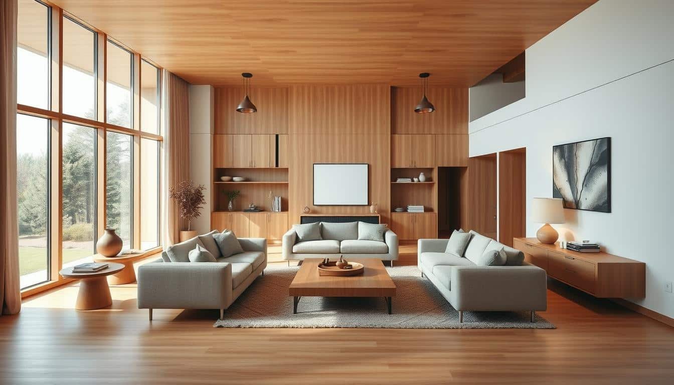
There’s an art to making rooms feel alive, and it starts with embracing nature’s palette. I’ve watched spaces transform from sterile to stunning simply by playing with natural materials. The secret? Letting each piece’s unique character shine through its grain and hue.
Wood isn’t just functional – it’s emotional. A cherry bookshelf whispers warmth, while ash flooring adds crisp contrast. These elements become your home’s fingerprints, creating layers that synthetic surfaces can’t replicate.
Mixing eras makes magic happen. Pairing mid-century walnut with rustic oak creates tension that feels intentional, not chaotic. I’ve seen $50 flea market finds look luxe next to custom pieces when their stories harmonize.
The best part? You don’t need perfect matches. Focus on balancing light and dark variations instead. Three tones usually hit that sweet spot between variety and cohesion. That’s how you avoid the “showroom effect” and craft spaces that feel authentically yours.
How to Use Warm Wood Tones in Flooring, Cabinetry, and Furniture
The secret to a cohesive design lies in three strategic choices. I begin every project by focusing on surfaces that anchor a space: underfoot structures, storage solutions, and statement pieces. Species like cherry and mahogany shine here, their red and golden undertones acting as natural mood boosters.
https://www.youtube.com/watch?v=FK7m3HE-nR8&pp=0gcJCdgAo7VqN5tD
Floors become your canvas. Rich hickory planks or caramel-stained oak create instant warmth, setting the stage for other elements. This foundation determines 70% of a room’s character – go too light, and you lose coziness; too dark, and spaces feel heavy.
For cabinetry, I seek depth. Chestnut-stained maple pairs beautifully with lighter floors, while walnut adds drama. Storage shouldn’t just hold items – it should whisper luxury through grain patterns that catch sunlight.
| Element | Top Choices | Undertones | Design Impact |
|---|---|---|---|
| Flooring | Hickory, Oak | Golden, Amber | Sets room temperature |
| Cabinetry | Maple, Walnut | Russet, Chocolate | Adds dimensional depth |
| Furniture | Cherry, Mahogany | Ruby, Caramel | Creates focal points |
Statement pieces tie everything together. A mahogany dining table becomes the heart of gatherings, while cherry end tables add pops of richness. Contrast is your friend – pair deeper hues with neutral upholstery to let nature’s palette sing.
Bedrooms and dining areas thrive with this approach. The result? Spaces that feel lived-in yet polished, like your favorite leather-bound book – familiar but full of surprises.
Identifying Dominant Wood Tones and Their Undertones
Finding the right balance starts with understanding your space’s natural leaders. Every room has a visual MVP – that one element demanding attention through size or placement. This becomes your design compass.

Recognizing Dominant Elements in Your Space
I hunt for the heavyweight champion first. Is it sprawling floors? A massive entertainment unit? These anchors set the rules. My living room’s oak floors dictated all other choices – their golden hue became my North Star.
Once identified, smaller pieces become supporting actors. A coffee table might echo the main tone, while shelves introduce contrast. This hierarchy prevents visual chaos.
Understanding Warm, Cool, and Neutral Undertones
Natural light exposes a material’s true personality. Morning sun reveals cherry’s blush, while evening lamps highlight walnut’s gray whispers. I keep paint samples handy to compare against my pieces.
Reddish hints scream “cozy cabin”, while blue-gray whispers “modern loft”. My trick? White paper tests. Place it near your material – suddenly, beige undertones pop against pure white.
Neutrals are peacemakers. They bridge fiery mahogany and sleek ash effortlessly. When stuck, I default to white oak – its chameleon-like quality works with 90% of palettes.
Mixing Wood Tones: Techniques for a Cohesive Look
Creating harmony between different wood elements feels like conducting an orchestra – each instrument plays its part without overpowering others. The magic happens when you balance contrast with subtle connections.

Incorporating Contrasting Pieces with Similar Undertones
My go-to strategy pairs bold color variations that share hidden DNA. Think espresso sideboards beside honey-toned chairs – different shades, same golden base. This creates drama without discord, like siblings with distinct personalities but matching dimples.
Last month, I transformed a client’s bland living room using this approach. Charcoal-stained shelves popped against caramel floors because both carried faint red undertones. “It looks expensive but lived-in,” they marveled. Mission accomplished.
Balancing with Similar Grain Patterns and Finishes
Texture tells silent stories. Sleek walnut tabletops pair beautifully with ash stools when their grains whisper similar secrets. For modern spaces, I lean toward tight, linear patterns – they’re chameleons that adapt to any companion.
Rustic designs demand bolder moves. Last fall, I matched chunky oak beams with knotty pine accents. The trick? Keeping finish types consistent. Matte surfaces united the pieces like shared fingerprints, while varied stains added depth.
Remember: repetition breeds rhythm. Echo each tone in at least two spots – a chair leg here, a picture frame there. Suddenly, what seemed random becomes intentional artistry.
Step-by-Step Guide to Creating a Warm Wood Interior

Designing with natural materials requires a roadmap. My clients often ask where to begin – the answer always starts with identifying your anchor. This foundational element becomes your design’s backbone, guiding every subsequent choice.
Selecting Key Furniture and Flooring Elements
Floors naturally claim the spotlight in most rooms. Their expansive surface area makes them ideal for setting the tone. I recently transformed a dining area using hickory planks as the base – their golden streaks became the room’s heartbeat.
Built-in shelving demands early attention. Unlike movable items, these fixtures commit to your space long-term. A client’s maple library wall once dictated their entire first-floor palette, creating flow between rooms effortlessly.
| Element | Recommended Choices | Role |
|---|---|---|
| Flooring | Oak, Hickory | Establishes base temperature |
| Primary Furniture | Walnut Table, Cherry Armoire | Creates focal points |
| Built-Ins | Maple Shelving, Birch Cabinets | Provides structural harmony |
Secondary pieces should whisper, not shout. After securing main elements, I add chairs or side tables that echo without mimicking. A recent living room project paired espresso shelves with amber-toned stools – different shades, united by shared reddish undertones.
Quality beats quantity every time. Invest in durable flooring and statement items first. These workhorses will outlast trends, letting you refresh accents seasonally while maintaining core warmth.
Expert Advice and Real-Life Design Inspirations
Great design whispers secrets through its details. Over years of collaborating with top creatives, I’ve gathered invaluable strategies for balancing natural materials. Let me share professional insights that transformed my approach – and can elevate yours too.
Interior Designer Tips on Mixing Wood Tones
Kate Aslangul of Oakley Moore Studios changed my perspective:
“Walnut’s neutral personality makes it the ultimate peacemaker between conflicting elements.”
This revelation helped me bridge cool concrete floors with amber-hued shelves in a recent loft project.
Bethany Adams’ wisdom sticks with me daily:
“Modern spaces demand discipline. Choose one temperature family and commit.”
Her advice rescued a sterile downtown apartment – we used all cool-toned ash finishes to amplify its architectural lines.
| Challenge | Expert Solution | Result |
|---|---|---|
| Orange oak cabinets | Added walnut accents | Modernized kitchen |
| Flat design scheme | Light-medium-dark formula | 3D visual depth |
| Historic home | Layered cherry/mahogany | Timeless warmth |
Case Studies and Successful Room Transformations
My favorite makeover involved stubborn 90s cabinetry. By introducing slate tiles and brushed nickel hardware, we made orange oak look intentional rather than dated. The secret? Repeating the wood’s undertones in adjacent rooms.
A Victorian renovation taught me historic charm pairs beautifully with bold contrasts. We mixed cherry end tables with mahogany beams, using Persian rugs to unite the elements. Guests now ask if the pieces are original to the house – the ultimate compliment.
Remember: successful spaces treat natural materials like spices. A pinch of contrast here, a dash of repetition there. When in doubt, ask: “Would this combination occur in nature?” The answer often guides you home.
Overcoming Design Challenges and Accessory Pairings
I once walked into a client’s home where espresso shelves glared at golden floors like rivals. The solution? A Persian rug that became their mediator. Accessories hold surprising power to resolve material conflicts and elevate your entire scheme.
Bridging Elements That Create Harmony
Textiles work magic in living room layouts. That walnut coffee table clashing with pale oak planks? Layer a jute mat underneath. Its earthy texture softens the contrast while letting both elements shine. My favorite trick: choose patterns containing both wood hues.
Metals act as neutral referees. Brushed brass lamps between cherry shelves and ash floors add sophistication without competing. Black iron drawer pulls can anchor light wood tones beautifully. Remember: finishes should complement, not match.
Natural materials break visual monotony. A marble tray on your table distracts from tonal differences. Woven rattan baskets beside dark cabinets introduce organic rhythm. These touches prevent spaces from feeling like lumberyards while highlighting your intentional mix.
 using WordPress and
No responses yet