This post may contain affiliate links. When you purchase through links on our site, we may earn an affiliate commission.
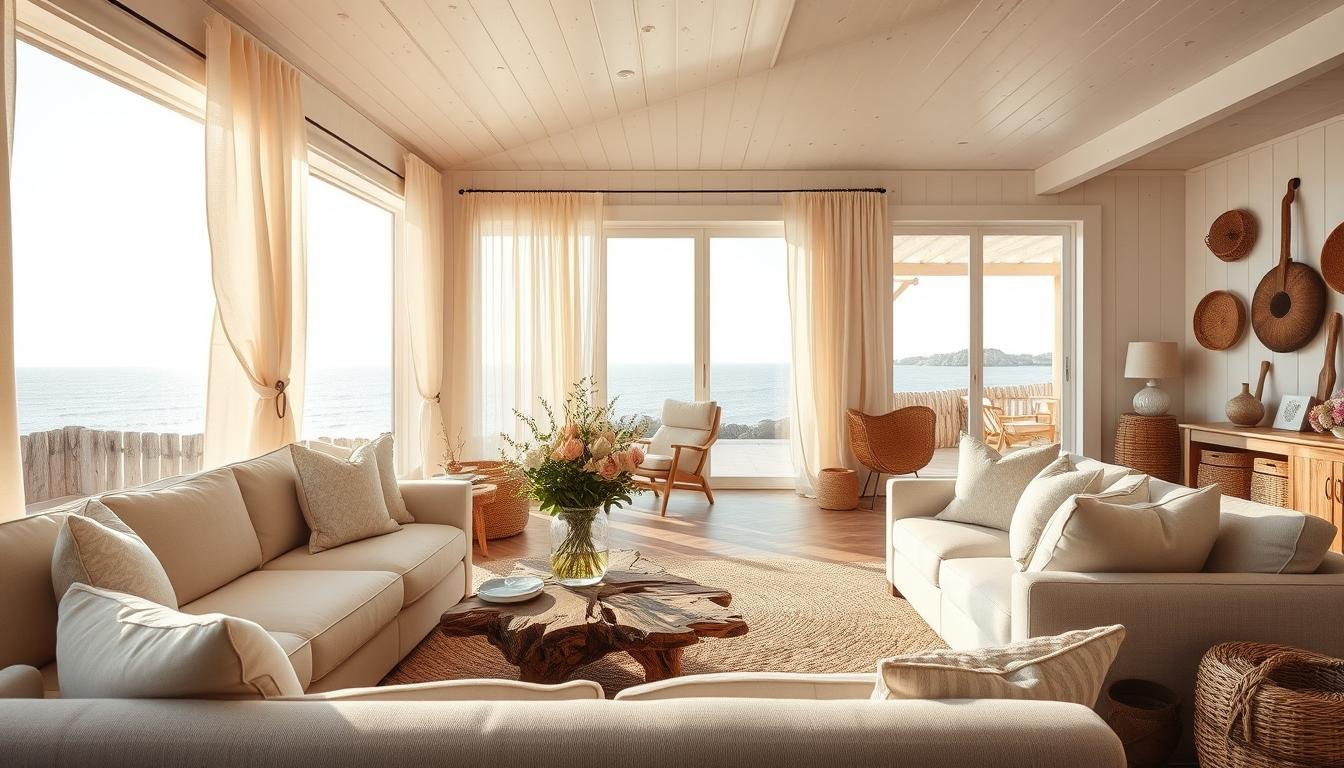
I’ll never forget the first time I walked into a friend’s home that felt like a seaside retreat. Sunlight streamed through sheer curtains, weathered wood accents whispered of ocean breezes, and the airy space instantly calmed my busy mind. That day, I realized blending nature’s simplicity with modern flair could transform any space into a serene escape—no beachfront required.
In this guide, I’ll show you how to balance organic textures like linen and jute with crisp, clean lines. Whether you’re starting fresh or refreshing your current setup, the goal is harmony: soft neutrals paired with hints of driftwood grays, layered lighting that mimics golden-hour glow, and functional pieces that prioritize comfort without sacrificing style.
We’ll explore how to choose furniture that anchors your space while keeping it light. Think slipcovered sofas in breathable fabrics, rattan side tables, and woven rugs that ground the room. Later sections dive into accessories—like shell-inspired decor and nautical art—that add personality without clutter.
Key Takeaways
- Mix natural materials like wood and linen with modern design for balance
- Use neutral tones and layered lighting to create calm, airy spaces
- Choose breathable fabrics and textured rugs for comfort and visual interest
- Incorporate subtle nautical accents without overwhelming the space
- Focus on functional furniture that supports relaxation and style
Understanding the Essence of Coastal Living
Growing up near Cape Cod, I spent summers watching sunlight dance on waves and collecting seashells that told stories of the tide. That connection to nature’s rhythm shaped how I design spaces today—not just aesthetics, but an emotional anchor to tranquility.
What Coastal Living Means to Me
For me, it’s about capturing the quiet magic of sand between your toes and salt-kissed breezes. My favorite projects blend breezy openness with intentional details—like a jute rug that mimics dunes or curtains that flutter like sails. It’s less about literal anchors and more about curating calm through mindful choices.
Key Ingredients for a Serene Vibe
Three elements define this style: light, simplicity, and texture. Sunlit spaces feel expansive, while clutter-free surfaces let the mind unwind. I once added just a rattan tray and cerulean throw pillows to a client’s neutral space—suddenly, it whispered “beach cottage” without shouting it.
Later, we’ll explore how to layer these ingredients through color and materials. But first, let’s focus on the foundation: designing a retreat that breathes as effortlessly as ocean air.
Selecting the Perfect Color Palette for Coastal Vibes
I once helped a city-dwelling client capture the essence of sunrise over water using nothing but paint swatches. Her cramped apartment transformed when we layered soft whites with whispers of seafoam—proof that color choices make or break the atmosphere.
Embracing Whites, Blues, and Sandy Beige
Start with a neutral foundation. Think of sun-bleached driftwood or frothy waves—these natural hues form your base. I often use Benjamin Moore’s “Simply White” on walls, then add depth with muted blues like “Harbor Gray”. Sandy beige tones in rugs or throws ground the scheme without darkening the space.
Subtle Pops of Warm Tones
Too much coolness can feel sterile. Last summer, I balanced a monochromatic blue bedroom with terracotta pots and amber glass lamps. The warmth made the blues feel alive, like sunlight hitting water. Try coral accents in throw pillows or honey-toned wood frames.
This approach works anywhere—from beach houses to high-rises. A Brooklyn loft I designed last year used pale blue curtains and oatmeal linen chairs. Clients said it felt “like a breath of fresh air” despite the urban view. Your palette should whisper relaxation, not shout theme park.
Incorporating Natural Materials into My Living Room
During a weekend project in Maine, I discovered how raw elements transform spaces. A reclaimed wood shelf I installed became the star—its knots and grain patterns telling stories of forests and shorelines. That’s when I realized: nature’s imperfections make interiors feel alive.
https://www.youtube.com/watch?v=qUfOb5-QDFk
Weathered textures work best. I pair driftwood-style coffee tables with rattan chairs to create contrast. The trick? Let each piece breathe. Too many organic elements compete—like seashells fighting for attention on a crowded beach. Stick to 2-3 statement items per zone.
“Natural materials age gracefully, gaining character like a favorite pair of jeans.”
When choosing furniture, prioritize comfort that doesn’t sacrifice style. My go-to is a linen-upholstered sofa with tapered wood legs. It blends softness with structure, much like dunes meeting firm sand. For smaller spaces, try a jute pouf—it adds texture without bulk.
| Material | Best Uses | Maintenance Tip |
|---|---|---|
| Reclaimed Wood | Shelving, accent walls | Dust with microfiber cloth |
| Rattan | Chairs, light fixtures | Wipe with damp cloth |
| Linen | Curtains, throw pillows | Spot clean only |
| Jute | Rugs, baskets | Vacuum weekly |
Balance is everything. Last month, I layered a chunky knit blanket over a sleek wood bench—proof that modern and organic can coexist. Let your space evolve naturally, like tide-smoothed stones finding their place.
Creating a Bright and Airy Space with Maximized Natural Light
I learned the power of sunlight while helping a couple transform their dim basement into a sunlit sanctuary. By replacing heavy drapes with sheer panels, we tripled the natural light—proving even windowless spaces can feel airy with smart design.
Sunshine acts like invisible furniture—it defines moods and highlights textures. My go-to strategy? Layer window treatments. Start with clean solar shades for privacy, then add gauzy curtains that filter golden-hour glow. This combo works in city apartments and country homes alike.
Here’s my favorite trick: Place mirrors opposite windows. In a recent project, I angled a vintage floor mirror to bounce light onto a textured jute rug. Suddenly, shadows vanished, and the room felt twice as bright.
| Treatment Type | Light Control | Best For |
|---|---|---|
| Sheer Curtains | Soft diffusion | Living areas |
| Solar Shades | Glare reduction | South-facing windows |
| Frosted Glass | Privacy + brightness | Bathrooms |
Don’t forget vertical spaces. Painting ceilings high-gloss white reflects 80% more light than flat finishes. Last month, I used this technique in a loft with low ceilings—clients swore they gained an extra foot of height.
Light transforms color too. Pale blues deepen like ocean horizons at dusk, while sandy neutrals glow warmer. Keep furniture low-profile to avoid blocking windows, and let sunshine be your boldest accessory.
Layered Textures for a Relaxed Coastal Feel
A client once asked me to soften her stark modern space without losing its clean lines. I draped a chunky knit throw over her leather sofa and layered a jute rug underfoot—suddenly, the room exhaled. Texture does more than decorate; it invites touch and creates emotional warmth.
Cozy Throw Pillows and Soft Rugs
Start with tactile layers that beg to be touched. Mix linen pillow covers with velvet ones in similar tones—the contrast adds depth without chaos. For rugs, I love pairing flat-weave jute with a plush wool layer. It’s like walking on sand meeting foam.
Mixing Natural Elements for Depth
Wood tones anchor airy spaces. Try a reclaimed oak side table next to a rattan lamp base. Last month, I styled a client’s shelf with driftwood bookends and ceramic vases—the combo felt organic yet intentional. Remember: vary scales. A large sisal rug balances delicate seagrass baskets beautifully.
| Material Pairing | Effect | Best Placement |
|---|---|---|
| Linen + Velvet | Subtle contrast | Sofas, window seats |
| Jute + Wool | Layered comfort | Under seating areas |
| Reclaimed Wood + Rattan | Earth-meets-ocean | Accent tables |
Keep textures cohesive through color. Neutrals let materials shine, while navy or sage pillows echo coastal hues naturally. The goal? A space that feels curated, not crowded—like treasures arranged by tide patterns.
Choosing the Right Furniture for a Coastal Chic Look
Last spring, a client asked me to transform her cramped city apartment into a breezy retreat. The breakthrough came when we swapped her bulky sectional for a streamlined sofa—proof that furniture shapes a room’s soul. Every piece should whisper relaxation while anchoring the space visually.

Highlighting the Coffee Table and Rattan Pieces
Your coffee table acts as the room’s anchor. I prefer organic shapes—think oval designs with driftwood finishes. Pair it with rattan stools that double as extra seating. Last month, I styled a client’s space with a reclaimed teak table and woven side chairs. The combo felt effortlessly curated, like treasures washed ashore.
| Element | Material | Styling Tip |
|---|---|---|
| Coffee Table | Reclaimed Wood | Add ceramic tray for organization |
| Side Table | Rattan | Top with textured lamp |
| Accent Chair | Woven Seagrass | Layer linen throw pillow |
Selecting Comfy Sofas and Accent Chairs
Your sofa should invite sinking in. Look for deep seats with performance fabric—spills vanish, but comfort stays. I recently paired a cloud-like sectional with rattan armchairs. The contrast between plush cushions and airy frames balanced cozy and chic perfectly.
Mix materials for depth: try leather ottomans with linen-upholstered chairs. One client’s navy velvet loveseat became the star when flanked by light oak side tables. Remember, furniture isn’t just functional—it’s the quiet poetry of your space.
Essential Coastal Decor Living Room Elements
Last summer, a client asked me to add the finishing touches to her space—those details that transform a room from bland to breathtaking. This final layer makes all the difference, like sea glass polished by waves. Here’s what I always include to anchor the vibe without overwhelming.
Start with organic shapes. Driftwood candle holders or a coral-inspired vase add subtle character. I recently styled a shelf with three bleached shells in varying sizes—simple, but they pulled the whole space together. Woven baskets are my secret weapon: perfect for storing throws or displaying eucalyptus stems.
Artwork should whisper, not shout. A framed seascape in muted blues or abstract sand-textured prints work beautifully. One client’s hand-painted wave mural became her favorite conversation starter. Remember: less is more. A single statement piece often outshines cluttered walls.
- Textured throw pillows in linen or hemp
- Ceramic table lamps with crackled glaze
- Rustic wood trays for corralling remotes
- Glass jars filled with collected sea stones
Placement matters most. Group items in odd numbers for balance, and let each piece breathe. A rattan mirror angled to reflect light? Genius. A chunky knit blanket casually draped? Instant coziness. These thoughtful touches turn any home into a sanctuary that feels both curated and carefree.
Enhancing Ambiance with Unique Lighting and Art
Last month, a client showed me how strategic lighting could elevate her bland space into a gallery-like retreat. We hung a cerulean abstract painting near a bronze floor lamp—suddenly, shadows danced like sunlight on waves. This transformation taught me that lighting and artwork aren’t just accents—they’re mood architects.
Bold Blue Accents in Artwork
Deep navy and azure hues add energy without overwhelming. I recently styled a client’s mantel with a textured blue resin sculpture. Paired with matte white walls, it became a focal point that “pulled the eye like tide meeting shore”, as she described. For subtle impact, try framed cyanotype prints or indigo-dyed textiles.
Mood Lighting Ideas for a Relaxed Feel
Layered illumination creates depth. Start with recessed lights set to warm white (2700K), then add dimmable sconces beside artwork. My go-to trick? Cluster three pendant lights at varying heights over seating areas—it mimics sunset’s golden glow.
| Lighting Type | Best Use | Effect |
|---|---|---|
| Adjustable Sconces | Highlighting wall art | Dramatic shadows |
| Rattan Floor Lamps | Corners | Diffused warmth |
| LED Strip Lights | Shelving | Subtle accentuation |
“The right lighting makes art breathe and spaces feel alive.”
Mix fixture finishes for visual interest. Bronze pairs beautifully with weathered wood, while brushed nickel complements crisp whites. In a recent project, I paired an oxidized brass chandelier with hemp drum shades—the combo felt both organic and refined.
Remember: lighting should enhance, not compete. Angle spotlights 30 degrees toward artwork to minimize glare. Use smart bulbs to adjust intensity throughout the day, creating rhythms that mirror natural light’s ebb and flow.
Using Wood Tones and Natural Accents for Warmth
A client once challenged me to warm up her minimalist apartment using only natural elements. We introduced a reclaimed oak console table—its rich grain patterns instantly added depth. This experience taught me that wood’s organic imperfections are its superpower for creating inviting spaces.

Weathered finishes work best for texture. Think driftwood-style frames or cedar shelves with visible knots. I recently paired a whitewashed coffee table with rattan stools—the mix felt both rugged and refined.
When mixing wood tones, aim for harmony. In a modern farmhouse project, I used walnut accents alongside ash beams. The contrast between dark and light created visual interest without chaos. “Let the material tell its story,” a carpenter once advised me.
Balance is key. Pair chunky pieces with sleek metals or glass. For airy spaces, choose slim-profile furniture like tapered leg side tables. A cerused oak media cabinet anchors while maintaining lightness.
Your home will look curated yet comfortable when wood tones echo nature’s quiet rhythm. Start with one statement piece, then layer complementary textures. The result? Warmth that feels effortless, like sunlight filtering through trees.
Mixing Patterns and Textures Like Stripes and Florals
Last fall, I experimented with bold navy stripes and blush florals in a client’s sunroom. The result? A space that felt both energetic and serene—proof that pattern play can elevate any design when done thoughtfully.
The secret lies in contrast. Pair angular geometric prints with flowing botanical motifs to create visual balance. I recently layered a hexagonal rug under a sofa with tropical leaf pillows—the mix felt fresh without chaos.
Combining Geometrics with Florals
Start with a dominant pattern, then add smaller accents. In a beach house project, I used oversized stripes on curtains as the foundation. Delicate fern-print throw pillows became the perfect counterpoint.
| Pattern Pairing | Scale Ratio | Best Use |
|---|---|---|
| Stripes + Florals | 3:1 | Window treatments + accent pillows |
| Geometrics + Organic | 2:1 | Area rugs + wall art |
| Abstract + Botanical | 4:1 | Statement chairs + table linens |
Color ties everything together. Stick to three hues max—like sand, seafoam, and slate. For modern room ideas, try monochromatic patterns. A client’s gray-scale living area features herringbone pillows and marble-print stools that “whisper sophistication” according to her guests.
Remember: negative space is your ally. Leave 40% of surfaces pattern-free to let eyes rest. These intentional gaps make bold choices feel intentional, not overwhelming. Your space should sing harmony—not shout competition.
Building a Cozy Reading Nook in My Living Room
Last winter, a client confessed she’d been using her dining chair as a reading spot for years. We transformed an underused corner into her favorite retreat—proving even small spaces can become sanctuaries for quiet moments. Start by identifying a spot with good natural light, like near a window or beside a seldom-used fireplace.
Creating a Comfortable Corner for Me
Choose seating that hugs you back. I love armchairs with deep cushions and washable slipcovers—perfect for tea spills or pet snuggles. Add a side table wide enough for books and a mug. My go-to? A round rattan piece that doesn’t crowd the space.
Layer textures to invite lingering. A sheepskin rug underfoot and linen curtains filtering soft light create instant warmth. Last month, I styled a client’s nook with navy velvet pillows against ivory linen—the contrast felt both rich and relaxed.
| Element | Purpose | Pro Tip |
|---|---|---|
| Adjustable Lamp | Task lighting | Choose warm bulbs (2700K) |
| Floating Shelf | Book storage | Install at arm’s reach |
| Oversized Throw | Comfort | Opt for machine-washable |
Personalize without clutter. Display favorite novels vertically with spines facing out, or stack art books as a side table base. A client once framed her grandmother’s handwritten recipes—now they double as wall art that sparks joy daily.
Your reading corner should feel like a hug in physical form. Whether you prefer minimalist modern or eclectic charm, let it reflect what you find restorative. Start small—even a plush floor pillow by a sunny window can become your escape hatch.
Creative Ways to Display My Coastal Collections
While beachcombing in Oregon last summer, I stumbled upon a twisted piece of driftwood that became my favorite display piece—its organic curves now anchor my shelf arrangement. Curating these treasures isn’t about quantity, but celebrating nature’s artistry through intentional placement.
Showcasing Seashells and Driftwood Gifts
Group similar items for impact. A client’s collection of spiral shells looked lost until we arranged them in a glass cloche—suddenly, they became sculptural art. For driftwood, lean larger pieces against walls as natural bookends or prop smaller fragments on floating shelves.
| Item | Display Method | Pro Tip |
|---|---|---|
| Seashells | Glass apothecary jars | Layer by size for depth |
| Driftwood | Wall-mounted ledges | Mix vertical & horizontal angles |
| Coral fragments | Shadowbox frames | Use neutral matting |
Using Open Shelving for Artifacts
Open shelves need breathing room. I style clients’ units using the “rule of thirds”—one-third decor, two-thirds functional items. A woven basket holding remotes pairs beautifully with sea-smoothed stones in a ceramic bowl.
Rotate pieces seasonally to keep displays fresh. Last spring, I swapped a client’s winter pinecones for sand dollars and a miniature sailboat model. The change felt like opening windows to the shore without redecorating.
| Shelf Zone | Styling Idea | Functional Pairing |
|---|---|---|
| Top | Tall driftwood sculpture | Stacked coffee table books |
| Middle | Shell cluster in tray | Cable-knit throw basket |
| Bottom | Anchor-shaped bookends | Ottoman with storage |
Infusing the Space with Personal Touches and Character
When a client showed me her grandmother’s hand-painted nautical charts, I realized true style emerges when spaces tell your story. These faded maps now hang above her sofa, blending family history with beach-inspired elegance. Personal items transform rooms from styled to soulful.
Displaying Meaningful Coastal Mementos
Start with items that spark joy. A client’s collection of Bahamian conch shells became bookends when displayed with purpose. Another framed vintage swimsuits as wall art—whimsical yet sophisticated. The key? Edit ruthlessly. Three curated pieces often speak louder than twenty.
Balance is everything. Pair sentimental objects with clean-lined furniture to avoid clutter. I styled a driftwood sculpture beside a modern glass lamp last month—the contrast made both pieces shine. Your treasures should feel intentional, not accidental.
| Item | Styling Tip | Effect |
|---|---|---|
| Sea glass jars | Group by color gradient | Subtle rainbow hues |
| Framed beach photos | Matte black frames | Modern nostalgia |
| Anchor-shaped hooks | Display towels or keys | Functional charm |
Let your color choices guide placement. Creamy ceramics pop against slate walls, while coral fragments glow beside white oak shelves. A client’s collection of blue bottles became her coffee table centerpiece—proof that personal style thrives through thoughtful curation.
Ask yourself: Which items whisper of salt air and sandy toes? Maybe it’s that striped blanket from Cape May or the shell your child found last summer. These fragments of joy turn houses into homes that look uniquely yours.
Incorporating a Fireplace as a Focal Point in Coastal Living
A client’s desire for a cozy gathering spot led us to transform their bland hearth into a textured masterpiece. Fireplaces anchor spaces like nothing else—their crackling energy draws people together while radiating both warmth and character. When designed thoughtfully, they become the soul of a room.
Using Natural Stone and Weathered Wood
Natural stone brings earthy grandeur. I recently paired honed limestone with reclaimed oak mantels—the contrast between rugged and refined felt like waves meeting shore. For smaller spaces, stacked slate tiles add texture without overwhelming.
Weathered wood introduces organic softness. Try floating shelves made from sun-bleached driftwood flanking the fireplace. They’re perfect for displaying ceramic vases or stacked books. Keep metal accents minimal—a single bronze sconce can highlight stone’s natural veining.
| Material Pairing | Effect | Maintenance Tip |
|---|---|---|
| Limestone + Oak | Rustic elegance | Seal annually |
| Slate + Cedar | Organic contrast | Wipe with damp cloth |
| Quartzite + Pine | Modern meets farmhouse | Avoid harsh cleaners |
Balance modern comforts. Install slim electric inserts behind stone facades for clean heat without chopping wood. Flank the hearth with linen-upholstered chairs—their relaxed vibe complements rugged materials beautifully.
“A great fireplace design feels discovered, not decorated.”
Last month, I styled a client’s hearth with chunky knit throws and a hammered brass log holder. The mix of textures made the space inviting yet intentional. Remember: your fireplace should whisper stories of crackling nights, not shout for attention.
Chic Tips for a Modern Coastal Look

Modern coastal isn’t a trend—it’s a philosophy I embraced when balancing concrete and sea grass in a Malibu remodel. The key lies in stripping back while keeping soul intact. Think less “beach shack” and more “curated gallery with saltwater views”.
Streamlined furniture anchors this look. I pair low-profile sofas with leggy armchairs in performance fabrics—durable enough for sandy toes, sleek enough for city lofts. My go-to combo? A cream sectional with tapered walnut legs and woven rattan stools that double as side tables.
“Modern coastal thrives on negative space—let your best pieces breathe like tide pools at low water.”
Details make the difference. Swap rope accents for brushed brass pulls on cabinetry. Choose chairs with angular frames softened by linen cushions. In a recent project, navy-and-white striped throw pillows quietly echoed maritime themes without overt nautical references.
| Element | Modern Twist | Traditional Counterpart |
|---|---|---|
| Lighting | Sputnik chandelier | Rope-wrapped pendant |
| Tables | Glass-top with iron base | Driftwood coffee table |
| Textiles | Textured bouclé | Burlap curtains |
Edit ruthlessly. One sculptural shell vase holds more power than a shelf of trinkets. I often style spaces in daylight, then remove three items—this ensures clarity. The result? A look that feels both fresh and timeless, like sea air meeting modern design.
Conclusion
Designing a living room that captures the essence of the shore doesn’t require a beachfront view—just thoughtful choices that whisper relaxation. Start with a foundation of airy neutrals and natural textures, blending weathered woods and breathable linens. These elements work together to create a coastal feel that’s both inviting and timeless.
Every choice matters. Soft lighting mimics golden-hour glow, while functional furniture offers comfort without clutter. Personal treasures—like collected shells or family heirlooms—add soul to the scheme. Your home becomes a sanctuary when these layers harmonize.
Remember: balance is key. Pair sleek lines with organic shapes in your living room, and let practicality guide your layout. Whether refreshing one corner or overhauling your entire space, focus on what brings you peace.
Now step back. Does this room reflect your idea of calm? Tweak until it does. The best spaces evolve like shorelines—gradually shaped by joy, not rigid rules. Embrace the process, and watch your home transform into a retreat with a harmonious vibe that’s uniquely yours.
 using WordPress and
No responses yet