This post may contain affiliate links. When you purchase through links on our site, we may earn an affiliate commission.
Color psychology is a fascinating field that explores how colors influence our emotions, behaviors, and overall well-being. As I delve into this subject, I find it intriguing how something as simple as a color can evoke a range of feelings and reactions. From the vibrant reds that can ignite passion to the serene blues that promote tranquility, colors play a significant role in shaping our experiences and perceptions.
Understanding color psychology allows me to harness the power of colors in my daily life, whether it’s in my home, workplace, or even in my wardrobe choices. Throughout history, colors have been imbued with meaning and symbolism. Different cultures have ascribed various interpretations to colors, which can further complicate their psychological effects.
For instance, while white is often associated with purity and peace in Western cultures, it can symbolize mourning in some Eastern traditions. This complexity makes color psychology a rich area of study, as I navigate the nuances of how colors can affect not just individual emotions but also collective societal attitudes. By exploring this topic, I aim to uncover how I can use color to enhance my environment and improve my mental state.
Key Takeaways
- Color psychology explores the impact of colors on human emotions and behavior.
- Warm colors like red and yellow can energize and stimulate the mind and body.
- Cool colors such as blue and green have a calming and relaxing effect on mood.
- Bright colors like orange and pink can promote positivity and happiness in a space.
- Balancing different colors in your environment can create a sense of harmony and stability.
Understanding the Impact of Colors on Mood
The Science Behind Color and Emotion
This connection between color and mood is not just a personal experience; research supports the idea that colors can elicit specific emotional responses. Warm colors like red and orange can increase heart rates and stimulate feelings of excitement, while cool colors like blue and green tend to have a calming effect.
Conscious Choices for Emotional Well-being
Understanding this relationship between color and mood has significant implications for how I design my living spaces and even how I dress daily. If I’m feeling low on energy, I might choose a bright yellow top to uplift my spirits. On the other hand, if I need to unwind after a long day, I might surround myself with soothing shades of blue or green.
Cultivating Desired Emotional States
This awareness empowers me to make conscious choices about my environment and personal style, ultimately allowing me to cultivate the emotional states I desire.
Using Warm Colors to Energize and Stimulate
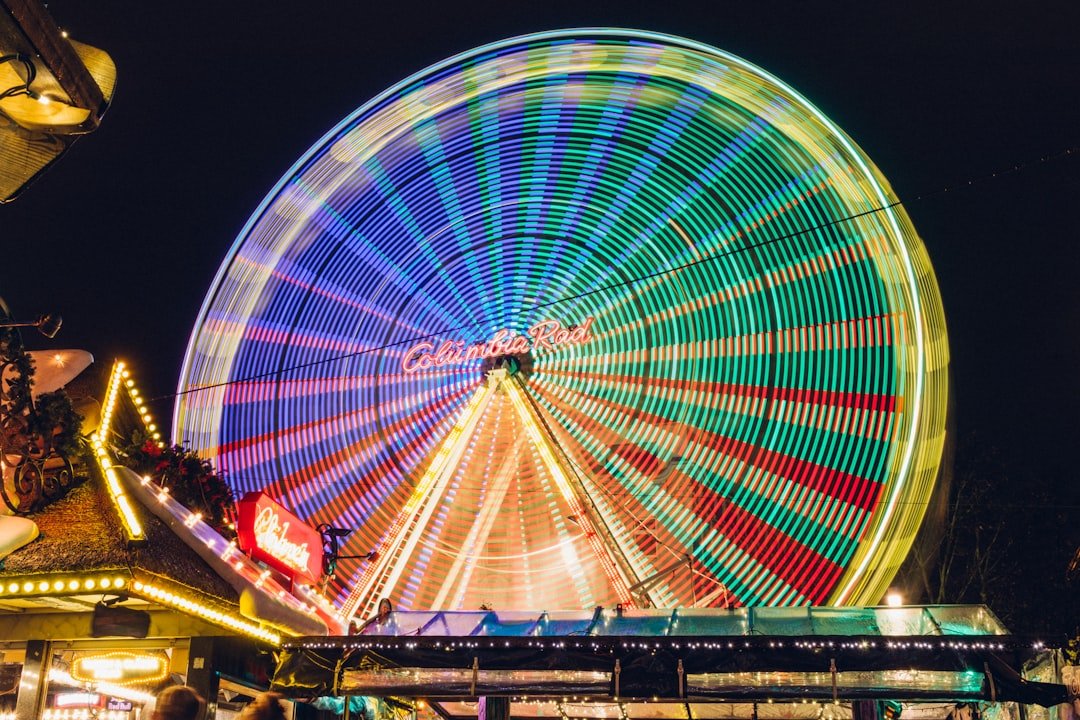
Warm colors such as red, orange, and yellow are known for their ability to energize and stimulate the mind. When I think of these colors, I often associate them with feelings of warmth, enthusiasm, and even passion. For instance, red is a color that can evoke strong emotions; it’s often linked to love and desire but can also signify urgency or excitement.
In my own experience, incorporating warm colors into my surroundings—be it through artwork or accent walls—has helped create an atmosphere that feels vibrant and alive. In practical terms, I find that using warm colors in spaces where I want to be active or social can be particularly effective. For example, painting my kitchen in a cheerful shade of yellow has made it a more inviting space for family gatherings and cooking sessions.
The warmth of the color seems to encourage conversation and laughter, making it a hub of activity in my home. Similarly, when I wear warm colors, I often feel more confident and ready to take on challenges. This connection between warm colors and energy is something I consciously leverage to enhance my daily experiences.
Utilizing Cool Colors to Calm and Relax
| Color | Effect |
|---|---|
| Blue | Calming and soothing |
| Green | Relaxing and refreshing |
| Purple | Tranquil and peaceful |
In contrast to warm colors, cool colors like blue, green, and purple are known for their calming effects. When I think about these hues, I often envision serene landscapes—think of a tranquil blue sky or lush green forests. These colors have a unique ability to soothe the mind and body, making them ideal choices for spaces meant for relaxation or contemplation.
Personally, I’ve found that incorporating cool colors into my bedroom has significantly improved my sleep quality. The soft blue walls create a peaceful environment that encourages restfulness. Moreover, cool colors can also help reduce stress levels.
When I’m feeling overwhelmed or anxious, surrounding myself with shades of green—often associated with nature—can provide a sense of grounding and balance. In moments of high tension, simply gazing at a calming blue or green object can help me regain my composure. This understanding of how cool colors affect my emotional state has led me to be more intentional about their use in my home office as well.
By painting the walls a soft green hue, I’ve created a workspace that fosters focus and clarity while minimizing distractions.
Incorporating Bright Colors for Positivity and Happiness
Bright colors are often synonymous with joy and positivity. When I see vibrant shades like fuchsia, lime green, or electric blue, I can’t help but feel uplifted. These colors have an infectious energy that can instantly brighten my mood and inspire creativity.
In my experience, incorporating bright colors into my environment—whether through decorative accents or artwork—has proven to be an effective way to cultivate an atmosphere of happiness. One of my favorite ways to use bright colors is through accessories in my living space. A few colorful throw pillows or a bold piece of art can transform an otherwise neutral room into a lively sanctuary.
Additionally, wearing bright colors on days when I need an extra boost has become a personal ritual for me. Whether it’s donning a vibrant scarf or choosing a pair of eye-catching shoes, these small choices help me project positivity while simultaneously lifting my spirits. The psychological impact of bright colors is undeniable; they serve as reminders to embrace joy and celebrate life’s little moments.
Balancing Colors for Harmony and Stability
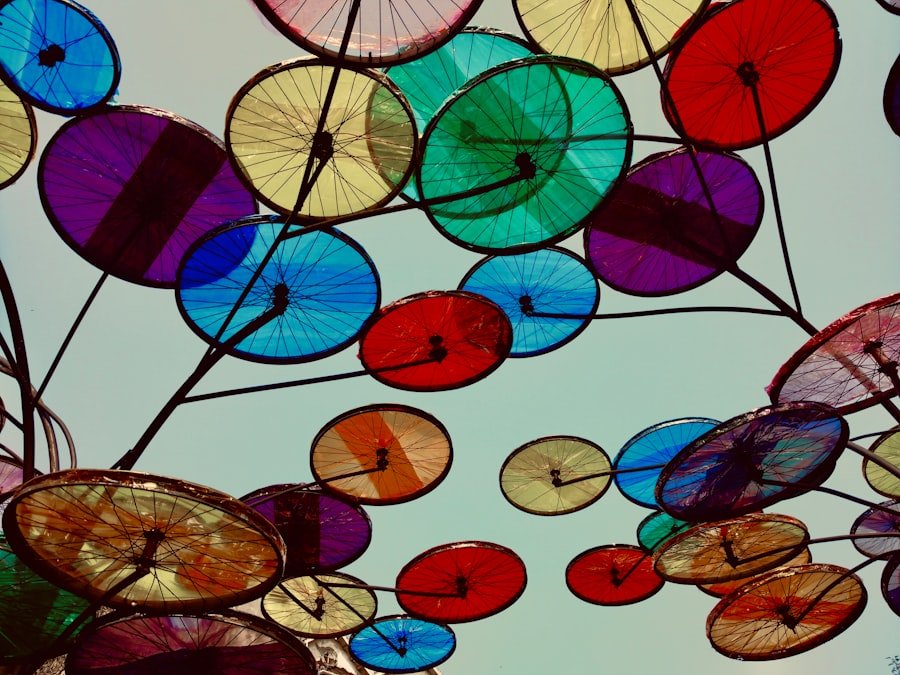
While the effects of individual colors are significant, the interplay between different hues is equally important in creating a harmonious environment. As I explore color combinations in my spaces, I’ve learned that balancing warm and cool tones can lead to a sense of stability and well-being. For instance, pairing warm oranges with cool blues can create visual interest while maintaining an overall sense of balance.
This approach allows me to enjoy the energizing effects of warm colors without overwhelming my senses. Incorporating neutral tones into my color palette has also proven beneficial in achieving harmony. Neutral shades like beige, gray, or white can serve as grounding elements that allow brighter or bolder colors to shine without clashing.
In my living room, for example, I’ve chosen a neutral base with pops of color through furniture and decor items. This balance creates an inviting atmosphere that feels both dynamic and serene—a perfect blend for relaxation and socializing alike.
Personalizing Your Environment with Color Choices
One of the most empowering aspects of color psychology is the ability to personalize my environment based on my preferences and emotional needs. Each person has unique associations with different colors shaped by personal experiences and cultural backgrounds. As I explore my own preferences, I find joy in curating spaces that reflect who I am while also supporting my mental well-being.
When designing my home office, for instance, I chose colors that resonate with me personally—soft greens for tranquility paired with vibrant yellows for creativity. This intentional selection not only makes the space visually appealing but also creates an environment where I feel inspired to work productively. Additionally, incorporating personal touches like artwork or photographs in specific colors allows me to infuse my personality into the space while reinforcing positive emotions associated with those hues.
Applying Color Psychology to Enhance Your Well-being
In conclusion, understanding color psychology has profoundly impacted how I approach my environment and daily life. By recognizing the emotional effects of different colors—whether they energize me or promote relaxation—I’ve gained valuable insights into how to enhance my well-being through thoughtful color choices. From using warm hues to stimulate creativity to incorporating cool tones for calmness, each decision contributes to creating spaces that nurture both body and mind.
As I continue to explore this fascinating field, I am reminded of the power that color holds in shaping our experiences. By personalizing my surroundings with intentional color choices, I not only create aesthetically pleasing environments but also cultivate emotional states that support my overall happiness and fulfillment. Ultimately, applying the principles of color psychology allows me to harness the transformative power of color in ways that enrich my life every day.
If you’re interested in learning more about creating a cozy and inviting space, you may want to check out this article on creating your personal oasis: a guide to cozy living. This article provides tips and ideas for transforming your home into a warm and welcoming sanctuary. By incorporating elements of color psychology, such as mood-lifting hues, you can enhance the overall ambiance of your space and promote a sense of well-being.
FAQs
What is color psychology?
Color psychology is the study of how colors can affect human behavior, emotions, and mood. It explores the impact of different colors on individuals and how they can influence our thoughts and feelings.
How can colors affect our mood?
Colors can have a significant impact on our mood and emotions. Certain colors are known to evoke specific feelings, such as red being associated with energy and passion, while blue is often linked to calmness and relaxation.
What are some mood-lifting colors?
Some colors that are commonly associated with uplifting moods include yellow, which is often linked to happiness and positivity, and green, which is associated with nature and tranquility. Bright and vibrant colors like orange and pink can also have mood-lifting effects.
How can color psychology be applied in everyday life?
Color psychology can be applied in various aspects of everyday life, such as interior design, branding, marketing, and even personal fashion choices. By understanding the psychological effects of different colors, individuals and businesses can use this knowledge to create environments and products that promote positive emotions and well-being.
Are there cultural differences in how colors are perceived?
Yes, there are cultural differences in how colors are perceived. Different cultures may have varying associations and meanings for certain colors. For example, while white is often associated with purity and cleanliness in Western cultures, it may symbolize mourning in some Eastern cultures.
Can color psychology be used to alleviate negative moods?
Yes, color psychology can be used to alleviate negative moods. By surrounding oneself with colors that are known to have uplifting effects, individuals can potentially improve their mood and overall well-being. This can be achieved through the use of color in interior design, clothing choices, and even through art therapy.
 using WordPress and
No responses yet