This post may contain affiliate links. When you purchase through links on our site, we may earn an affiliate commission.
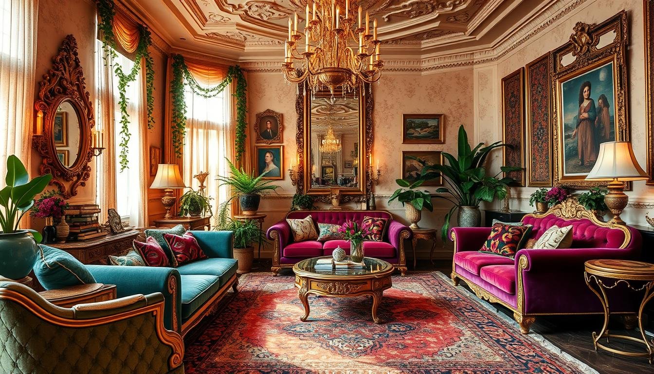
I’ve always believed spaces should tell stories. That’s why I fell in love with designs that embrace bold patterns, rich textures, and fearless self-expression. Unlike minimalist trends, this approach celebrates layered details—think mismatched art frames, heirloom rugs, and statement furniture. It’s not just about filling a room; it’s about curating joy.
For me, blending vintage finds with modern accents creates magic. A mid-century lamp might sit beside a neon sculpture, while floral wallpaper anchors the whole look. Designer Heather French calls this “organized chaos with intention,” and I couldn’t agree more. Pinterest boards lately are exploding with similar energy—mixing jewel tones, metallic finishes, and global-inspired textiles.
Ready to dive in? I’ll share how to balance vibrant colors without overwhelm, plus tips for creating gallery walls that pop. From patterned tiles to thrifted treasures, we’ll explore ways to make every corner reflect your personality. Let’s turn “more is more” into a design superpower.
Key Takeaways
- Maximalism thrives on personal storytelling through layered textures and bold choices
- Mixing vintage and modern pieces adds depth and character to any space
- Pinterest trends highlight saturated colors and curated clutter for 2024
- Designers recommend starting with a focal point, like an oversized artwork or rug
- Gallery walls and patterned tiles are versatile ways to inject visual interest
Welcome to My Maximalist Home Journey
My adventure into bold interiors began with a single vibrant rug that changed everything. That splash of crimson and gold underfoot taught me spaces could celebrate life’s messy beauty. I’d love for you to join me as we explore how fearless design choices can transform ordinary rooms into layered stories.
Years ago, my style felt safe—neutrals, clean lines, predictable layouts. Then I discovered how mixing eras and textures creates magic. A flea-market chair paired with geometric pillows. Velvet curtains framing a neon wall sculpture. Each addition became a chapter in my evolving design story.
This approach isn’t about clutter—it’s about curated energy. I’ve found that saturated hues and contrasting patterns make my living areas feel alive. Friends often say walking into my space feels like stepping into a gallery where every piece sparks conversation.
What surprised me most? How this style fuels daily joy. Bold interiors don’t just please the eye—they energize the spirit. Whether you’re drawn to tropical prints or metallic accents, daring design invites people to connect with their surroundings deeply.
In upcoming sections, I’ll share how to balance statement pieces with functional layouts. We’ll dive into pattern mixing tricks and real-room makeovers that prove more really can be more. Ready to rewrite your space’s narrative?
What Is Maximalist Decor?
Maximalism isn’t clutter—it’s a curated explosion of personality where every piece has purpose. This style shouts “more is more” through saturated hues, tactile fabrics, and objects that spark joy. Think velvet pillows piled high beside ceramic vases, or framed art competing playfully for wall space. It’s about bending rules to create spaces that feel alive.
Unlike minimalist decor, which strips rooms to essentials, this approach layers textures and eras without apology. I’ve paired my grandmother’s embroidered tablecloth with neon napkin rings—because why shouldn’t nostalgia meet modern edge? Designer Justina Blakeney once said, “Your space should hug you when you walk in.” That’s the magic here: rooms become visual diaries.
| Maximalism | Minimalism |
|---|---|
| Bold color combinations | Neutral palettes |
| Mixed patterns & textures | Single focal points |
| Personal artifacts displayed | Hidden storage solutions |
| Rule-breaking layouts | Symmetrical arrangements |
What things make it work? Start with one statement piece—a floral rug or gilded mirror—then build around it. My living room mixes Moroccan tiles with a neon sign because contrast creates energy. Remember: there’s no “too much” if each item tells your story. Up next, I’ll share how to blend patterns and colors without chaos.
Embracing Bold Colors and Eclectic Patterns
Color became my secret weapon for transforming blank walls into emotional landscapes. I discovered that pairing terracotta reds with teal blues could evoke warmth, while citrus yellows against charcoal grays sparked energy. The trick? Treat your space like a canvas—every hue tells part of the story.
https://www.youtube.com/watch?v=72SmPUjLUsQ
Mixing Color Palettes
I once combined three palettes in my dining area: sunset oranges, forest greens, and metallic golds. It worked because I anchored them with a neutral cream rug. Designer Heather French taught me this gem: “Start with a dominant shade, then layer accents at 30% and 10% ratios.” Now I use her formula everywhere—from throw pillows to bookcases.
Pairing Patterns Successfully
Stripes, checks, and florals can coexist peacefully. My favorite hack? Vary the scale. A large floral print on curtains pairs beautifully with petite gingham chair cushions. For a recent project, I mixed:
- Oversized geometric wallpaper
- Medium-scale zebra-print ottoman
- Tiny polka-dot napkins
This creates rhythm without chaos. Even small pieces matter—a textured vase or patterned coaster adds depth to a table setup. Remember: contrast is your friend, but balance keeps it harmonious.
Infusing Nature Motifs for Lively Spaces
Heather French’s work on Isla’s room taught me how nature-inspired designs can electrify interiors. She once told me, “A single leaf-patterned pillow can ripple energy through an entire space.” That philosophy changed my approach—now I weave organic textures and outdoor hues into every corner.
Sunset and Sunrise Inspirations
I’ve draped my living room in gradient curtains mimicking dawn’s soft pinks and oranges. These shades pair beautifully with terracotta pots and woven baskets. For a recent kitchen refresh, I layered peach-toned dishes under amber pendant lights—creating warmth that lasts all day.
Floral and Organic Designs
Botanical prints aren’t just for wallpaper. I’ve framed pressed ferns beside abstract art depicting stormy skies. Even vintage finds get a nature twist—like repurposing an old ladder as a vertical herb garden. Heather’s trick? “Use irregular shapes in accessories—driftwood bowls or asymmetrical vases—to avoid rigidness.”
Three ways to bring nature indoors:
- Cluster smaller plants at varying heights for visual movement
- Choose artwork with organic lines over geometric precision
- Layer jute rugs under floral-patterned ottomans
Creating Statement Areas with Patterned Tiles and Dramatic Accents
Surfaces and shades hold transformative power. I learned this while studying Galeana Younger’s kitchen design, where black-and-white chevron tiles turned a functional space into a dynamic showstopper. These patterns became the room’s heartbeat, proving even practical zones deserve drama.
Patterned Tiles in Kitchens
Younger’s zigzag floor design taught me bold surfaces anchor a room. In my own kitchen, I layered hexagonal cement tiles beneath brass pendant lights. The geometric shapes contrast with rustic wood shelves, creating tension that feels intentional. As Heather French advises: “Let one element shout so others can whisper.”
Dramatic Red Accents
French’s crimson library shelves inspired my experiment with fire-engine red. I painted a living room alcove this shade, then added a gold-framed abstract art piece. The combo energizes without overwhelming because neutral textiles and matte black lamps balance the intensity.
Three rules for cohesive statements:
- Pair large-scale patterns with solid-color furnishings
- Use metallic finishes to bridge contrasting hues
- Introduce organic shapes (like curved vases) to soften angular designs
Whether through tiles or bold color, these accents become conversation starters. The key? Treat every decor choice as a character in your space’s story—no bit players allowed.
Highlighting Unique Accessories and Art Pieces
Walking into a room should feel like flipping through someone’s favorite photo album—each piece sparking curiosity. This philosophy drives my approach to selecting accessories and art that command attention while weaving personal narratives. Designer Fran Keenan’s work taught me how chunky frames and eclectic arrangements turn blank walls into dynamic storytelling canvases.

Chunky Frames and Gallery Walls
I once transformed a bland hallway using mismatched frames in varying thicknesses—some gold-leafed, others matte black. Fran’s rule? “Let frames act as punctuation marks, not the entire sentence.” My gallery wall mixes family photos, abstract prints, and even a vintage clock, creating rhythm through contrast.
Three ways to curate standout displays:
- Pair oversized landscapes with petite botanical sketches
- Use floating shelves to layer 3D objects beside flat art
- Anchor groupings with one bold piece at eye level
Imperfections add charm. A cracked frame becomes character when surrounded by sleek modern art. Recently, I hung a child’s crayon drawing beside a Baroque-style mirror—the juxtaposition sparks joy daily. Remember: your accessories should whisper secrets about who lives there, not just decorate.
Curating a Gallery of Bold Decor Finds
What makes a space unforgettable? For me, it’s the thrill of hunting down pieces that whisper, shout, and sing in harmony. My gallery of finds isn’t just decoration—it’s a living scrapbook of adventures, influences, and conversations.
Designer Kelly Wearstler, featured in Architectural Digest, once said:
“Every object should converse with its neighbor while telling its own story.”
This philosophy guides my approach. A hand-carved mask from Mexico City sits beside a neon sign from Brooklyn—each item chosen for its emotional resonance.
Inspiration from Iconic Designers
Jonathan Adler’s fearless use of color taught me to pair a $5 thrifted vase with luxury textiles. His work proves style isn’t about price tags—it’s about personality. I’ve adopted his rule: if it makes your heart race (in a good way), it belongs in your gallery.
| Traditional Gallery | Bold Approach |
|---|---|
| Matching frames | Mixed materials & eras |
| Neutral backgrounds | Patterned walls as stage |
| Single art style | Photos, textiles, sculptures |
Three ways to start your collection:
- Choose a theme (travel memories, favorite colors)
- Mix textures: glossy ceramics with rough-hewn wood
- Rotate pieces seasonally to keep energy fresh
My favorite find? A chipped teacup from my grandmother’s attic. It’s not “perfect”—but placed beside a modern geometric sculpture, it becomes perfectly imperfect. That’s the magic of curation: creating dialogues between pieces that people can’t help but discuss.
Designing Small Spaces with Maximalist Flair
Christian Harder once showed me how a 100-square-foot nook could outshine grand ballrooms. His secret? Treating compact spaces as stages for dramatic self-expression. While some fear clutter, I’ve found tiny rooms thrive when every inch radiates intention.
Harder’s approach revolves around vignettes—curated clusters that tell micro-stories. In my studio apartment, a thrifted brass lamp anchors a corner layered with:
- Textured throw pillows from Morocco
- A framed vintage scarf
- Stacked art books as side tables
Maximalist Vignettes
These groupings create focal points without crowding. I balance boldness by keeping walls light and using mirrors to amplify natural light. As Harder advises:
“Think of every surface as a storytelling opportunity—even a windowsill.”
My go-to trick? Hanging gallery walls vertically to draw eyes upward, making ceilings feel higher. Mixing small-scale patterns with one oversized decor item (like a chunky vase) adds depth. Recently, I transformed a narrow hallway using peel-and-stick floral wallpaper and floating shelves for rotating thrift finds.
| Small Space Strategies | Large Room Approaches |
|---|---|
| Vertical gallery walls | Expansive pattern repeats |
| Multi-functional furniture | Statement seating groups |
| Reflective surfaces | Bold ceiling treatments |
Don’t shy from color in petite rooms—my living area’s emerald accent wall makes the space feel cozy, not cramped. The key? Edit ruthlessly. Each item must earn its place through joy or function.
Maximalist Home Decor: Bold Ideas for Every Room
Rooms become conversation starters when layered with intention. I’ve found that even the smallest corners can radiate personality through curated clashes of pattern and purpose. Let’s explore how to ignite this energy in every space.

Showcasing Unique Room Finds
Take my friend’s powder room—a space most would overlook. She papered every surface in tropical blooms, then hung a neon ‘Wash Your Dreams’ sign above the sink. The clash of organic patterns and electric lighting creates unexpected harmony. It’s proof that even utilitarian areas deserve drama.
In another project, a kitchen’s checkerboard floor anchors mismatched chairs painted in cherry red and cobalt blue. A vintage ‘Eat More Cake’ sign ties the colors together while injecting humor. These choices transform functional rooms into mood-lifting experiences.
Three rules I follow when curating spaces:
- Start with one ‘wow’ piece (like hand-painted tiles)
- Mix eras intentionally—a 1970s lamp beside abstract art
- Edit collections seasonally to prevent visual fatigue
Your style shines brightest when you define the rules. That sunroom filled with cacti and crystal chandeliers? It works because the owner embraced contrasts that spark joy. Remember: every room whispers stories through its decor—make yours worth hearing.
Incorporating Vintage Textiles and Antique Treasures
Thrift stores became my treasure maps when I realized how a single embroidered tablecloth could rewrite a room’s story. Fran Keenan’s living room taught me this—she draped a 1920s lace curtain over a sleek concrete coffee table, creating tension that feels both nostalgic and fresh. Vintage textiles add soul to modern spaces like seasoning in a recipe.
Mixing Old with New
My favorite hack? Pair flea-market linens with geometric throw pillows. Last month, I layered a crocheted bedspread over a neon yellow sofa—the clash felt electric. Keenan says: “Let patina and polish coexist. Worn edges make new things feel approachable.”
| Traditional Approach | Bold Mixing |
|---|---|
| Matching fabric patterns | Floral quilts + striped pillows |
| Neutral base colors | Jewel-toned walls as backdrops |
| Single-era furniture | Victorian chairs + acrylic tables |
Three ways I source unique pieces:
- Search estate sales for hand-stitched napkins or faded tapestries
- Use thrift store scarves as curtain tiebacks
- Frame damaged textiles as wall art
These finds become conversation starters. My great-aunt’s tea-stained doily now crowns a modern side table—a tiny heirloom stealing glances daily. When blending eras, let each piece’s history shine through. That’s how style becomes timeless.
Layering Colors and Patterns for a Harmonious Home
David Tsay’s genius lies in treating walls like collages—he once transformed a bland dining area using newspaper-print drapes layered under velvet cushions. This approach taught me that harmony emerges when textures and hues converse rather than compete. Let’s explore how to orchestrate these dialogues in your space.
Textile and Color Layering Techniques
Start with a neutral base—cream walls or beige flooring—then build upward. In my living room, I draped a chunky knit throw over a striped sofa, adding patterned throw pillows at 45-degree angles. Tsay advises: “Let each layer reveal something new when viewed from different angles.”
- Anchor bold patterns with solid-colored rugs or curtains
- Mix fabric weights (sheer linen + heavy brocade)
- Repeat accent colors in unexpected places—book spines or ceramic vases
Balancing Bold and Neutral Tones
My coffee table demonstrates this balance perfectly. A vibrant mosaic tray holds neutral stone coasters, while stacked art books in earthy tones ground the arrangement. For high-impact areas, I follow the 70-20-10 rule:
| Bold Elements | Neutral Elements |
|---|---|
| Floral accent chair | Beige walls |
| Geometric throw pillows | Solid wood shelves |
| Striped table runner | Natural fiber placemats |
Small pieces matter most. Matching drawer pulls or consistent metal finishes create invisible threads tying disparate elements together. Last week, I updated my entryway by layering a zebra-print stool over a jute rug—proof that contrast thrives when guided by intention.
Transforming Tabletops into Artful Displays
Your coffee table isn’t just furniture—it’s a stage waiting for its spotlight. I approach these surfaces as 3D canvases where functional items become part of the decor. A well-styled arrangement turns morning lattes into gallery-worthy moments.

Functional Yet Fabulous Designs
My favorite table setup balances practicality with pizzazz. A sculptural tray holds daily essentials: coasters shaped like citrus slices, a ceramic creamer doubling as a vase, and art books stacked beneath a geode bookend. Each thing serves purpose while adding texture.
Three rules I follow:
- Anchor with one large art piece (like a bronze bowl)
- Mix heights using cake stands or nested boxes
- Rotate seasonal accessories (pinecones in winter, seashells in summer)
For coffee stations, I layer a patterned cloth under a sleek espresso machine. Mini succulents in thrifted teacups soften the techy vibe. Designer Justina Blakeney’s advice sticks with me: “If you use it daily, make it delightful to look at.”
| Functional Items | Decorative Twins |
|---|---|
| Remote control | Stored in beaded box |
| Coasters | Hand-painted tiles |
| Napkins | Vintage handkerchiefs |
The key? Edit ruthlessly. Leave space for that novel you’re reading or tonight’s wine glass. Your table should invite both admiration and use—never one at the expense of the other.
Elevating Walls with Murals and Eye-Catching Gallery Walls
Blank walls are missed opportunities in design storytelling. I discovered their potential while transforming a client’s bland hallway using hand-painted vines that seemed to grow across the ceiling. This experience taught me vertical surfaces hold unmatched power to shape a room’s energy.
DIY Mural Ideas
My favorite project involved creating a sunset gradient using leftover paint samples. Here’s how:
- Sketch rough outlines with chalk
- Layer acrylic paints from lightest to darkest hues
- Add texture using sea sponges or crumpled foil
For renters, removable wallpaper with tropical patterns offers drama without commitment. I recently installed a peel-and-stick forest scene behind my living room sofa—it feels like waking up in a fairy tale.
Curated Art Arrangements
Gallery walls thrive on contrast. I group thrifted frames with modern canvases, leaving 2-3 inches between pieces. Designer Athena Calderone’s advice sticks with me: “Let one color thread through every art piece for visual glue.”
| Balanced Display | Bold Statement |
|---|---|
| Matching frame colors | Mixed metals & finishes |
| Symmetrical layout | Organic clustering |
| Neutral backgrounds | Patterned wallpaper base |
Three rules I follow:
- Place largest piece at eye level first
- Use painter’s tape to test layouts
- Incorporate 3D elements like woven baskets
Whether through murals or collected art, walls become diaries of personal decor journeys. The key? Treat them as evolving canvases—perfection optional, personality mandatory.
Practical Tips and Common Pitfalls in Maximalist Design
Many assume that more items mean more personality, but true style thrives on intentional choices. The line between curated collections and chaotic stuff depends on strategic editing. I learned this after a friend pointed out my hallway’s “visual traffic jam”—too many small frames competing for attention.
Avoiding Clutter Without Losing Character
Designer Athena Calderone taught me this golden rule: “Edit until every piece earns its spot through beauty or purpose.” Now, I rotate accessories seasonally—storing off-season things keeps displays fresh. A crowded shelf? I remove three items and reassess the balance.
Three strategies prevent overwhelm:
- Use trays or baskets to corral smaller objects
- Group similar colors in odd-numbered clusters
- Leave 30% negative space on surfaces
I once spent time styling a bookshelf only to realize the arrangement felt forced. The fix? Replacing half the decor with plants and leaving breathing room between stacks. Remember: people should notice your favorite pieces, not the effort behind them.
| Intentional Display | Cluttered Look |
|---|---|
| Varied heights with clear sightlines | Flat rows of same-sized items |
| Mixed textures in coordinated hues | Random colors competing for attention |
| Functional items incorporated artfully | Purely decorative objects gathering dust |
Your way of arranging should feel natural. If styling takes more time than enjoying the space, simplify. Let that hand-painted vase shine solo instead of crowding it with smaller trinkets. Trust your gut—it knows when to stop.
Curating a Cohesive Look for a Personal Space
Creating a space that feels uniquely yours starts with listening to what makes your heart skip a beat. My living area became a testament to this when I combined my grandmother’s quilt with a neon floor lamp—two pieces that shouldn’t work but somehow do. This fusion taught me cohesion thrives when you prioritize emotional resonance over rigid style rules.
Weaving Your Narrative Through Objects
I once transformed a bland room using travel souvenirs arranged by color. Seashells from Bali sat beside Moroccan tea glasses, all united by turquoise accents. Designer Jonathan Adler’s advice rings true: “Your space should be a scrapbook of your life’s adventures.”
Three ways to blend personal treasures:
- Group items by texture rather than era
- Use lighting to highlight meaningful collections
- Repeat one color in unexpected places
| Traditional Styling | Bold Personalization |
|---|---|
| Matching furniture sets | Mix of inherited and modern pieces |
| Neutral art prints | Family photos beside abstract paintings |
| Single-theme decor | Globe collection next to concert posters |
Your home becomes a sanctuary when every corner sparks memories. That chipped mug from college? Display it proudly. Those concert tickets? Frame them. True harmony emerges when you define the rhythm of your space.
Conclusion
Design becomes revolutionary when it mirrors our inner worlds. Through layered textures, fearless colors, and meaningful art, we craft spaces that pulse with life. Remember—every clustered frame or thrifted treasure adds chapters to your visual story.
This approach isn’t about filling rooms. It’s about stitching together things that spark joy. Whether mixing eras or playing with patterns, the magic lies in balancing boldness with intention. As I’ve learned, even small choices—a painted alcove or hand-me-down quilt—can redefine a home’s energy.
Don’t fear the eclectic. Start with one vibrant pillow or an unexpected wallpaper. Let your shelves become curated galleries of travel finds and family heirlooms. True style emerges when you set the rules.
Ready to begin? Your space deserves more than function—it craves personality. Embrace that neon sign beside grandma’s china, or pair striped curtains with floral chairs. In maximalism, every mismatch becomes a deliberate dance of self-expression. Now go paint your world brave.
 using WordPress and
No responses yet